Showing posts with label software. Show all posts

Friday, November 9, 2012

The Lean Media mindset: Can it work for large companies?

Since the failure of my first software startup and the early traction of my latest digital publishing venture, I've been thinking a lot about how to make successful media products in the digital age. I have come to believe that Lean methodologies used in software development can also be applied to media ... but require some modifications in order to accommodate certain characteristics of the media industry.

My thinking about Lean Media actually goes back to the 2000s, long before I even heard the term "Lean". In the 2000s, I was responsible for managing and developing new media products for large organizations -- Harvard University and IDG. One of my takeaways from these experiences was that small, independent teams with a willingness to rapidly create and develop content and new products (special feature, website, online community, etc.) could enjoy small successes as well as the occasional hit. Where these efforts suffered was in the follow-up ... responding to user feedback cycles and taking the nascent products to the next level. This was often an issue of insufficient resources, as well as directives from the center of the organization to concentrate efforts somewhere else.

In addition, I have observed that few traditional media companies are structured to operate in such a fashion. Even if the resources are available to prototype, the mandate to have an independent team work on these types of projects may not be there. Indeed, the idea of letting audiences see a raw, unfinished product may seem like heresy to executives obsessed with polished designs and powerful brands. The expectation for new products is they look and feel as professional and established as a big brand.

What I am trying to do now is develop a framework for Lean Media that both startups and large organizations can use for product development. My blog post titled "A proposal for a Lean Media Framework: Input and iteration required", describes how I am approaching the problem:

... When I started my second venture this summer, the ebook experiment, I pledged to myself that I would attempt to actively follow the Lean philosophy. Get products out to the marketplace as soon as possible. Measure. Iterate. Improve. Some of these processes were already ingrained, owing to my earlier experiences with rapid product development in the online media and music industries, as well as the mobile software startup, and my grad school experience, which emphasized iterative product development. But I was more methodical with measuring and incorporating feedback. I also paid a lot of attention to revenue, something that I had not been focused on with any previous venture or media experiment.

As the ebook venture progresses, my mind has been circling back to the inconsistencies I observed earlier. Yes, Lean methodologies do work for media content. They can lead to better products, and better sales. However, the Lean approach does not take into account important factors — such as brand and creative processes — that can determine the success or failure of media ventures.

Therefore, I believe there is an opportunity to build a new Lean framework that is specific to media ventures — a Lean “mod” for media, if you will. The goal of building a Lean Media Framework is to help startups and established companies build innovative products, platforms, and business models that have a higher chance of success and can contribute to new models of creation, distribution, and consumption.

If you are interested in helping me develop this idea, let's have a discussion. Feel free to leave comments below or contact me using the email address on this page.

Monday, September 3, 2012

iBookstore agreement: Do you really understand the fine print?

I'm in the process of posting one of my books (Dropbox In 30 Minutes) to Apple's iBookstore, using iTunes Connect. Apple's software platforms are heavily lawyered, and iBookstore is no exception: It's 13,585 words long, which would take between 30 minutes and an hour to read.

As an author, even if you did read everything, would you understand it? Here's just one paragraph:

APPLE, ISSUER, AND THEIR LICENSEES, AFFILIATES, AND LICENSORS MAKE NO WARRANTIES, EXPRESS OR IMPLIED, WITH RESPECT TO VOLUME VOUCHERS, THE VOLUME PURCHASE PROGRAM, THE APP STORE OR THE ITUNES STORE, INCLUDING, WITHOUT LIMITATION, ANY EXPRESS OR IMPLIED WARRANTY OF MERCHANTABILITY OR FITNESS FOR A PARTICULAR PURPOSE. IN THE EVENT THAT A VOLUME VOUCHER IS NONFUNCTIONAL, YOUR SOLE REMEDY, AND OUR SOLE LIABILITY, SHALL BE THE REPLACEMENT OF SUCH VOLUME VOUCHER. THESE LIMITATIONS MAY NOT APPLY TO YOU. CERTAIN STATE LAWS DO NOT ALLOW LIMITATIONS ON IMPLIED WARRANTIES OR THE EXCLUSION OR LIMITATION OF CERTAIN DAMAGES. IF THESE LAWS APPLY TO YOU, SOME OR ALL OF THE ABOVE DISCLAIMERS, EXCLUSIONS, OR LIMITATIONS MAY NOT APPLY TO YOU, AND YOU MAY ALSO HAVE ADDITIONAL RIGHTS.

I kind of get the gist of it -- Apple is not making any guarantees regarding the voucher program -- but then it dissolves into vague lawyerese at the end. I don't quite understand it, but what choice do I have? What choice do any of us have, when we "agree" to a software license, or EULA, or terms, or TOS, or 50-page legal document?

Wednesday, August 15, 2012

How to disable iCloud as the default save destination in OSX

Yesterday, I installed Mac OSX Mountain Lion on my MacBook Pro. This version of the Macintosh operating system is very closely integrated with iCloud -- maybe too closely integrated. I like the cloud computing concept for file backups and storage (after all, I wrote a manual for Dropbox) but iCloud really gets in your face. It's the default destination for opening and saving files, which I find very irritating. I've built a file folder hierarchy using the local hard drive, Dropbox and Google Drive, and don't want iCloud to be the default destination.

So I changed it. Here's how:

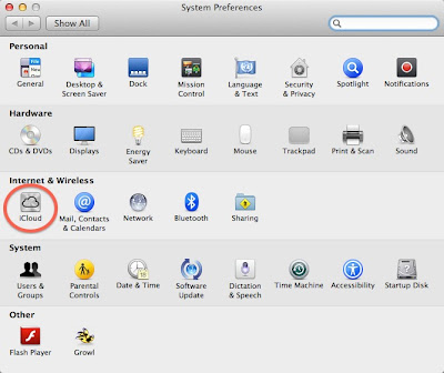
Open System Preferences by clicking the Apple icon in the upper left corner of the screen. Then press the iCloud icon, circled in the following screenshot:

iCloud System preferences change settings

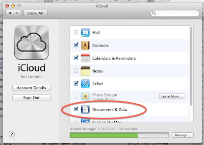
Then deselect the "Documents and Data" checkbox, as shown below:

iCloud documents and data checkbox

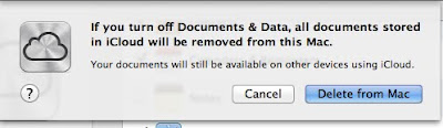
You will be prompted with the following warning:

icloud warning

It sounds drastic. It means is that documents stored in iCloud (from any iCloud-enabled device you own) are no longer synced to your computer. But it also gets rid of iCloud as the default destination for saving or opening files.

It would be great if Apple simply had an option to treat iCloud as a folder on your hard drive, much in the same way Dropbox and other cloud storage systems such as Google Drive work (see also my manual for Google Drive). Or, Apple disabled iCloud as the default "save" location.

But the company has two reasons for integrating iCloud so tightly into your Mac's storage and file systems:
  1. iCloud only has 5 GB of free storage. By forcing iCloud as the default storage location, the limit will rapidly be crossed and some people will be forced to upgrade to paid storage plans.
  2. Apple wants to make sure that its personal cloud storage system triumphs over competing products such as Dropbox and GDrive.

If enough people start turning off iCloud, Apple may rethink its approach to the iCloud user experience. On the other hand, as long as the competition is so strong, and the market for personal cloud services is still in its infancy, Apple may be forced to stick with the current setup.

Tuesday, July 31, 2012

What is XSLT? The 10-minute version ...

I spent some time this week learning Extensible Stylesheet Language (XSLT), which is used for styling XML documents. Another way to think of it: XSLT is to XML as CSS is to HTML. Moreover, if you have HTML/CSS knowledge, picking up XSLT is not too hard.

I got started with this video, which shows a very clear example of how to use XSLT:


Another resource that will be helpful to beginners is the w3schools XSLT site.

Sunday, July 22, 2012

Tech support stories: "id 10 T" and other IT acronyms

Years ago, I developed an online community for Computerworld called Shark Bait. It was targeted at IT staff, and anonymous users often shared stories from their workplaces. Sometimes they were about confusing technologies (which everyone has suffered through) or frustrating office politics. At other times, the stories were about people failing to follow instructions, mixing up different technologies, or otherwise behaving in a clueless matter when calling the IT support desk ("where can I get a Google Docs for Dummies?"). No names were ever used in these stories, of course.

tech support stories, idiot usersI recently spotted a reddit thread about the secret codewords that are used at some companies to describe certain types of customers. A gaggle of IT staff weighed in with their code names for stupid computer users, starting with this comment:
I work at an IT center. We regularly talk about the "id 10 T" error. Meant that we were dealing with an idiot.
Other terms/acronyms followed:
  • PICNIC: Problem In Chair, Not In Computer
  • TSTO: Too Stupid To Operate
  • EBK: Error Behind Keyboard
  • EBCAC: Error Between Computer And Chair
  • PEBKAC: Problem Exists Between Keyboard and Chair.
  • Layer 8/9 error: There are seven layers in the OSI model of computer networks. The 8th layer is the user.
  • Code 18: The problem is located 18 inches away from the monitor.
  • EEOC: Equipment Exceeds Operator Capabilities
  • FB-PC: F***tard behind PC
  • OHE: Operator Headspace Error
  • C2K: "Chair to Keyboard" problem
  • CBE: Carbon-Based Error
  • ESO: Equipment Smarter than Operator

When tech support acronyms go too far 

While secret codewords and acronyms help IT staff relieve the boredom or frustrations of their own jobs, it's cruel to be on the receiving end of these jokes. Sometimes, things can go too far. It's easy to create a culture of "us vs. them" or build up so much contempt for users that a culture of mutual hostility emerges and festers.

To wit: Jimmy Fallon's SNL character, "Nick Burns, Your Company's Computer Guy":


(Sorry, I couldn't find any longer videos of Nick)

Tuesday, May 15, 2012

Yahoo's Synced Messages folder

yahoo mail synced messages folder

A few million Yahoo users (including me) got this message in our inboxes this morning, explaining the mysterious "Synced Messages" folder that had been added to our accounts. Here's the explanation we received:

At Yahoo!, ensuring the safety and security of your data is important to us, and we know how critical your email is to you. We recently experienced an issue syncing emails for some of our users when accessing email from an IMAP device like an iPhone or an Android phone. Emails that you might have moved from your inbox to folders (including the trash folder) may have been temporarily unavailable. We fixed this issue, and recovered emails that may not have been synced to the right folder.

This is what you can expect to see:

- We have automatically added a folder called "Synced Messages" to your email account today located in the left navigation of your inbox.

- Our systems identified emails that may have been subject to the syncing issue and added them to the "Synced Messages" folder.

This is what you should do:

- Open the "Synced Messages" folder and move any messages you wish to keep to the inbox or your other personal folders.

- After you move the messages you wish to keep, you can delete the remaining messages in "Synced Messages" folder as well as the folder itself. The "Synced Messages" folder will remain in your account until you delete it.

At Yahoo!, we strive to give you the best email experience possible. We apologize that some email was not synced properly, and please know that this issue has been fixed.

You may also be interested in:

TMobile monthly 4G + Samsung Exhibit II = Android on the cheap

Friday, February 24, 2012

Getting close to launching our app

We're getting close to launching the Invantory app for iOS mobile devices. What does the app do? Well, the first iteration is aimed at making it easy for people to buy on Craigslist with an iPhone or iPad. Here's a screenshot of what a classifieds listing looks like:

guitar classifieds

This looks a lot different than what you typically see on the PC/Web version of Craigslist. In addition, the experience of browsing listings on a mobile device using Invantory is really unique. Instead of looking at text lists and using search engines, the focus is on photos. This helps people quickly determine what is of interest, and also helps them evaluate quality.

Future versions of the Invantory Craigslist app will do lots of other things, including creating classifieds and distributing the listings elsewhere.

Has it been tough building an app? For my partner Sam, it has been extremely time-consuming, with many technical hurdles to overcome. Are we nervous about the launch? Absolutely. Are there ups and downs associated with running a startup? Every week I am on a startup roller coaster. But nevertheless we are making progress and are really looking forward to what matters: Whether or not people will like using the app. We hope you can try the app and let us know. Download the app via the Invantory website, or sign up to be notified by email when it launches.

Sunday, January 8, 2012

Google Earth overlays

In the past year, I have had a few chances to play with Google Earth and try out some of the amazing tools that come with the program. For the Social Television class I took at the MIT Media Lab, I used placemarks, 3D buildings, and zooming animation to create the software demo for our final project. More recently, I was able to use Google Earth to create Craigslist coverage maps that show the rough boundaries of the five Craigslist areas in Massachusetts.

How did I make the different-colored areas in Google Earth? By using overlays. It's a drawing function that lets users trace points on a map with a mouse. Once the points are joined, the area looks filled in. Different colors and transparencies can be applied, which lets overlapping areas be clearly shown (see the Invantory blog post, above for an example of overlapping overlays).

Overlaps are an extremely useful tool. For instance, in the map below, I wanted to show Newton, Massachusetts, and nearby communities and commuter destinations using different-colored overlays. I basically hand-matched the inner overlay to the actual boundaries of Newton, which are a display option in Google Earth. The outer overlay was hand-drawn according to municipal boundaries as well as my own rough estimate of the area of downtown Boston that many Newton residents commute to every day:


Google Earth is a free download. I recommend using a reasonably recent and powerful desktop computer, as it uses lots of processing power to run and render sophisticated 3D images.

Sunday, December 25, 2011

500,000 page views

Last month, one of my blogs passed a major milestone: 500,000 page views. The Statcounter report is here:
500,000 page views for my blog
Some other relevant data about this figure: Statcounter has been measuring traffic on that blog since 2005 or 2006. I have been also running Google Analytics on the same blog, but it shows a lower figure -- about 400,000 page views for the same period but still shows about a quarter-million unique visitors (differences between the two tools are shown here). I've generated several thousand dollars in AdSense revenue from the blog over the years -- not enough to live on, but a welcome addition these days considering I have no other income from the classifieds startup that I cofounded.

These numbers may not be impressive. After all, some blogs may get that much Web traffic in a single month. But what I find so interesting is that well over half the traffic to Harvard Extended has come to the blog after I stopped updating it in late 2008. In other words, people still find great value in content that's between three and six years old. It may not be "fresh", but it's deep and relevant and useful to them (average time spent by each visitor is more than 90 seconds, according to Google Analytics).

Google, of course, has helped bring most of this traffic, either directly through search or indirectly through references from other blogs or news sites that were originally sourced via search. But there are also people who have bookmarked it, or know about it through reputation and remember the URL.

Thursday, December 15, 2011

Huffington Post traffic shows Chrome on top

Yesterday, one of my other blogs got a traffic spike, thanks to a link at the bottom of this Huffington Post article. It wasn't a lot of visitors (so far, about 120) but what I found remarkable was the breakdown of the browser traffic:
Huffington Post browser stats. Huffpo browser traffic shows chrome on top
Half of the visits were from Chrome users? Safari beating out all flavors of IE by a 3:1 ratio? I see the Huffington Post as a generally tech-savvy crowd (they get their news from blogs, after all) but they are hardly early adopters -- more like early mainstream.

If this is a sign of things to come, watch out Microsoft ...

Thursday, October 13, 2011

The iCloud tax for Mac users


Last night, I updated my iPod touch to iOS 5. Lots of people had reported problems, but my update went smoothly, and soon I was going through the setup for some of the new features, such as iMessage, the iPod mapper, and iCloud. As with most Mac updates I've performed over the years, it was relatively painless and actually kind of fun learning about some of the neat new things my iPod was now able to do, including connecting to cloud-enabled storage services such as iCloud, Google Drive, and Dropbox.

This morning, however, fun got a kick in the nuts. In my email inbox was an iCloud message, which said:

Welcome to iCloud. The Apple ID for your iCloud account is [redacted] and it’s what you’ll use to get your iPhone, iPad, iPod touch, Mac, and PC set up. Just follow these instructions and you’ll be up and running in no time.

Once iCloud is set up, it stores your content and wirelessly pushes it to all your devices. For example, buy a song with iTunes on your computer, and it will appear on your iPod touch and iPad. When you snap a photo on your iPhone it will automatically be sent to your iPad. You can start creating a Pages document on your iPhone, and put the finishing touches on it from your iPad. There’s no need to dock or sync to your computer. With iCloud, it just works.

We hope you enjoy using iCloud.

Sounds innocent enough, right? But then I clicked through to the iCloud setup page on Apple.com, and was presented with this:

The iCloud tax for Mac users

Hold on. Lion is required, just to use the free 5GB version of iCloud? That's not a trivial upgrade, and it’s not something I wanted to do anyway, until iCloud came around. Even worse, the Lion upgrade costs $30 meaning I’ll be out $60 just to use a single feature (we have have an iMac and an MacBook Pro) (Update: It's $30 for both machines, if you already have Snow Leopard/OS X 10.6 installed, more if you have older versions of OS X installed. Thanks @jlgolson, @nowever, and many commenters below for the tips).

But wait, there's more. Windows users also have access to iCloud. How much does it cost them to start using it?

Nothing.

That’s right, $0 -- at least if you have bought a new Windows PC in the last three years or so. The iCloud setup page for Windows users says, "To enable iCloud on your Windows PC, install the iCloud Control Panel for Windows (Windows Vista Service Pack 2 or Windows 7 required)". That's a bummer if you are still using an old PC with XP or earlier versions of Windows, but for the approximately half of Windows machines that have Vista SP2 or Win 7 installed, iCloud is free to try.

A much smaller percentage of Macs have Lion installed -- around 10%, according to Apple CEO Tim Cook earlier this month, meaning the owners of the other 90% will have to pay up if they want to start using iCloud on their Macs. The pain will be exacerbated by the fact that Lion is ugly and apparently unnecessary (Gizmodo: “I don’t need Lion, and you probably don’t need it either”).

As a founder (see What Is Dropbox and other In 30 Minutes guides) I've been thinking a lot about serving the needs of customers, and one thing that seems painfully obvious is you never abuse the trust of your core. I understand that there are technical and strategic reasons for Apple forcing Mac users to upgrade to Lion if they want to use iCloud, but it creates a negative perception when a core group of customers -- people who own Macs -- has to pay extra to use a feature that another group -- Windows users -- get for free.

Weigh in below. I'd love to hear your thoughts about this.

Sunday, October 2, 2011

Computer music and the power of the algorithm

I've been thinking about "computer music" a lot lately, prompted by an observation at a child's birthday party last week. In a room full of 7-year-olds, most recognized the 8-bit "wakka wakka" and other sound effects from Pac Man (when "Pac Man Fever" was playing on the stereo). All of them knew the Mario Bros. theme song, originally created in the 1980s. They not only liked it, many of them spontaneously began to act the role of Mario moving through the maze. As I watched them dance, I thought, isn't it amazing that these relatively primitive digital sounds still hold so much power!

Today via Hacker News I happened upon a discussion of simple algorithms that can be used to generate interesting -- and dare I say, catchy -- patterns in an 8-bit audio emulator. Someone even created a simple online script to let anyone mess around with the variables (the best I came up with is this bass-heavy loop) but some better-sounding experimentation took place with some different algorithms and C programs. The results can be heard in this short YouTube clip:


If you are interested in geeking out some more, try a better-quality script & emulator or follow the Hacker News discussion and check out the video below of a symphony written for dot-matrix printers:

Sunday, July 10, 2011

iOS game development: The making of Egg Drop


It's an exciting feeling to be a part of a team that creates something special. It's even more exciting when you see early users not only getting a kick out of the product, but asking to use it again and again.

educational iPhone game
That was our experience with Egg Drop on the iPhone, an educational game and our student team's final project for 11.127/252/CMS.590, Computer Games and Simulations for Education and Exploration (see also my post on an earlier student project from the same class, "A curriculum for learning computer programming in WoW"). Our assignment, which built on nearly three months of instruction, theory, readings, and other projects, was to design and produce a digital game that is playable for 15-20 minutes. "You should identify clear learning goals and map them onto game dynamics," we were told. To actually develop the game, it took about 24 days from the initial ideation sessions to the final presentation at class demo day.

There is a lot of flexibility in the term "digital game," and the half-dozen student teams in the class pursued all kinds of ideas. On demo day, we saw Terminus, a text-based adventure to teach terminal commands ("Zork meets terminal," was one way of describing it). Another student team created a PC game called Rocketmouse that taught children the fundamentals of gravity.

The class had a lot of Course 6 undergraduates, including some who had written games in the past. But the instructors (Eric Klopfer and Jason Haas) made an effort to balance out the teams with experienced programmers and people who couldn't program, but were able to handle other tasks.

Our team didn't go into the project thinking that we would make a mobile game. The ideation process started with the class brainstorming on potential learning topics; those ideas were put on a whiteboard and then people could choose which team they wanted to join. Inspired by a recent engineering documentary about the construction of a helipad on top of a wind-blown skyscraper, I suggested doing some sort of construction-based game that would teach basic architectural concepts. At the time, I was thinking of something on a PC or the Web, which would allow for a more sophisticated interface.

Alec, a Course VI classmate with whom I had worked on a “digital gates” board game earlier in the semester, was interested, along with a few other undergraduates. We discussed how to improve the concept. One of the first suggestions was to do it as an iPad game. The idea was to use a touch-screen interface to build a skyscraper, and then testing the strength of the construction with various environmental forces such as wind, earthquakes, and other disasters. Alec came up with a clever twist: How about turning the game into a variation of Angry Birds? Instead of being the birds trying to get at the pigs, the player would be the pig, trying to protect the egg from being knocked down, by building a strong-enough structure.

The “Reverse Angry Birds” proposal (also known as “Reverse Upset Avians”, or RUA) was put on a whiteboard with about a dozen other ideas. It got some votes from the class, and was chosen as a finalist project. Five people joined the team in all, and we started to refine the idea and discuss the practicalities of implementing them.

One decision that we had to make right away concerned the platform. While the iPad sounded promising, there was a problem: Aside from me, no one had an iPad, which would make life difficult for our developers when it came time to test the app. The iPhone seemed like a better idea, because:
  • Three of us had iPhones or an iPod touch
  • Three of us had Macs, which meant we could work in Xcode, Apple’s developer tool for the iOS SDK
  • Alec had experience developing games and developing on the iPhone platform, and was also familiar with a 2D game engine for the iPhone called cocos2D.
The team agreed that the iPhone/Xcode path was the way to go. Clearly, myself and the one other person who were not Course VI would be unable to build a game, but there was room for us to do “code-like” activities, ranging from building artwork and sound files to creating levels in XML. I was capable of doing those tasks (and had some prior experience with level design in our 6.898/Linked Data final project), and could do user testing/QA (I had two young subjects who were willing to pitch in, as described below).

In the proposal document submitted to our instructors, we described the game as follows:
Egg Drop is a physics-based game designed for the iOS platform that attempts to teach basic intuition of physics and stable structures.

Because it is an iOS game, the only way to play Egg Drop (barring a release on the Apple app store) is to download and compile the source. The source of the game is hosted publicly on Github and can be found at:

https://github.com/alect/Digital-Egg-Drop

Learning Goals:
  • Gain a rudimentary understanding of physics, construction and other principles involved in building structures
  • Learn strategies for building stable structures that can survive the elements.
  • Learn to use resources in an optimal way to meet construction goals.
  • Develop the hypothesize -> experiment -> redesign strategy of designing, which is a useful skill in many wider disciplines than construction. The flow of the game should lead the player to use this strategy inherently, and hopefully bring the strategy with them from the game.
Our plan was approved, and we got started on RUA. MIT has built up a culture around experimentation and prototyping and we all got to work pretty quickly. Alec was the lead developer, and took on tasks relating to integrating the physics engines, building the objects and resource manager, and creating a sound engine. He built a working prototype within a few days and uploaded it to github, which let those of us with Macs download it and try it out in Xcode’s iPhone simulator.

Another Course Sixer, Sarah, hadn’t used Xcode or Objective C before, but got up to speed very quickly. She was responsible for much of the final design as well as an in-game tutorial, which really helped make the game more appealing (you can see the tutorial in the gameplay video at the bottom of this post). She also created the system to import levels in XML format, which made it easy for me to do some age-appropriate level design and implementation on my own for our user testing -- before the XML engine was built, in order to alter levels during testing I had to change values in arrays and arguments in ResourceManager.mm. These changes were difficult to share with the rest of the team and prone to error, so Sarah’s work was very helpful. A third Course Six concentrator, Stephen, didn’t have a Mac (a requirement for Xcode) but worked on artwork, sound files, and documentation. The other member of the team worked on level design.

The game evolved from our original vision of creating a variation of Angry Birds. Creating the gameplay and artwork for the pigs and birds would have been extremely difficult and time-consuming (we only had a few weeks before demo day on May 10). We settled for a slimmed-down version of the game in which the goal was to build a structure that would protect a single egg from an onslaught of natural disasters at the end of each round. For instance, the kid-friendly level #3 used the following XML as inputs:


On the screen of the iPhone simulator, this translated to an egg resting on the plain at the start of the game (posx and posy describe its starting position). The player could place, in order, two vertical wooden planks, a horizontal straw block, and a horizontal brick, before the disaster (a meteor falling from the sky, directly on top of the egg) occurred. The only way to survive: Placing the two vertical wooden planks next to the egg and the horizontal brick resting on top of the plank, over the egg. Any other combination resulted in the egg breaking and “game over” for the player.

As the game evolved, we dropped “Reverse Upset Avians” and started calling it EggDrop. It was an instant hit with my kids, even before we had meteors and earthquakes. The simple physics of placing planks around the egg was entertaining enough in sandbox mode (see screenshots, below). But when better artwork, different building materials, nails and other elements were added, it was addictive. My younger child in particular would ask to play it when he came from school, and after I came home from a long international trip, one of the first things he asked to do was play the game on the iPhone simulator.

One interesting element of game design that came up with the Egg Drop project was the target audience. I thought we should really be clear who we were targeting at the outset. Segmentation and “Total Addressable Market” exercises are part and parcel of the Sloan way in classes such as New Enterprises. But we ended up taking a much more flexible approach, as described in our proposal:
“One advantage of iOS and other touch devices is that they support a very wide age range. We hope the game will be playable by children as young as five or six while still being entertaining to adults. Young children will most likely reap the most benefit from the educational concepts the game presents. In addition, we found that we could cater levels to fit different age ranges, making the game customizable for all learning levels.”
While age customization was possible, for the purposes of testing we only had two versions: One for us and college-aged friends, and a simpler version for younger elementary school students. I worked extensively on the kid version, and developed new age-appropriate levels based on regular user testing. Here are a few excerpts from my user testing diary, which was submitted as part of our final project:
4/30/11

The kids had a fun time with a modified version of alect-Digital-Egg-Drop-3357c7c (I added about 30 extra block and nail objects, so they could play longer). They definitely get the nailing aspect of the construction, and used it to protect their egg almost immediately.

++++++++++++++++++++++++++++++++

5/4/11

Tested alect-Digital-Egg-Drop-9f0fc79 on my son. This was the first time he had seen the disasters, which he really enjoyed (especially the earthquake, which sometimes sends blocks flying).

I was also surprised to see that he right away figured out the solution to the wind disaster (nailing something to the floor) which vexed me when I saw it the first time.

He also used extensive experimentation to try to solve all of the problems he observed. For instance, for the earthquake, he tried positioning the blocks close to and further away from the egg, nailing different size blocks to the floor, etc. He gave up after 4-5 unsuccessful tries, at which point I showed him how to do it. Then he played to the end (two tall planks).

He noticed and liked the new egg [artwork].

++++++++++++++++++++++++++++++++

5/6/11

Played build alect-Digital-Egg-Drop-d3eb420, which has some memory issues that Alec addressed. However, we noticed a bug after the second level that prevented us from going to the third level -- the level up button didn't respond on the emulator.

The gameplay is fun, and as a proof of concept it is good, but I wonder if the learning couldn't be more robust. Maybe if we had more time ...

++++++++++++++++++++++++++++++++

5/9/11

Building out levels in XML. I am using Google Docs spreadsheet to track the progressive difficulty of the challenges, and using my own judgement and gameplay to see how they work.

The advantage of using oneself for testing is I can quickly rearrange the blocks or disasters, reinsert them into ResourceManager.mm, and play the new version on the emulator.

I am going to try to introduce it to my son tomorrow morning ... I unfortunately won't see him for the rest of the day.

+++++++++++++++++++++++++++++++++++++++++++++

5/10/11

My son hadn't seen the new designs, so he was very happy to see the artwork. He also liked the meteor, cushion blocks, and the idea of the termites. He got up to speed pretty quickly on the simple progressive levels I set up for him. On the quake level, which requires surrounding the egg with cushions and nailing them together in a certain way, he couldn't solve it, and took an interesting area of experimentation that I hadn't considered -- reinforcing the cushions with wood braces.

The other thing that I am conscious of is the game really has to be customized to age/ability. What appealed to him as a 6-year-old wouldn't appeal to older players.
One thing that’s worth mentioning about the testing is I didn’t need to pressure my kids to help out. Both of them love games. My son has probably tried a few dozen age-appropriate titles on my iPod touch, and regularly returns to the ones that are most entertaining. It was clear that Egg Drop fell into the same league as favorite games such as Angry Birds, Cro-Mag, Fruit Ninja, and the Simpsons game. He simply couldn’t get enough of Egg Drop, even during the early builds when the game was still rough around the edges. Here’s a video of him trying out an early version, about one week into the development process:


Beyond the experience of working on iOS game design, there were several other takeaways from the project. One was being able to participate in a rapid prototyping process integrated with user testing. This combination is held up as an ideal at MIT and elsewhere, but getting the right team and the right testers in place can be difficult. Before coming to MIT, I worked in Web media for years. Even on those rare occasions when my employers had adequate engineering resources in place to develop new products, testing was usually handled in-house and at a very late stage. Sometimes this was because testing was not considered a crucial part of the product development process, but at other times it was difficult to find actual users or the product had to be kept under wraps out of fear of premature leaks or tipping off the competition.

For Egg Drop, not only was the team technologically top-heavy (three out of five were programmers), but we had access to real users in our target audience, which let us observe gameplay, hangups, and other aspects of the user experience. This feedback loop led to better gameplay and helped us eliminate speed bumps and outright bugs at a relatively early stage.

A second takeaway related to gameplay theory. While the Egg Drop project was focused on real gameplay issues and the practicalities of developing a game for a mobile device, I did find myself looking back to some of the research that we had studied in class earlier in the semester, in particular the readings from James Paul Gee. He articulated a lot of modern thinking about models, video games, and learning in his 2008 paper, Learning and Games (e.g., “Video games offer people experiences in a virtual world ... and they use learning, problem solving, and mastery for engagement and pleasure”). His “situated learning matrix” for understanding how context-based learning in games can be applied to the world at large was described in terms of first-person shooters in 3D worlds. But one can see how a modeling experience in a 2D world like Egg Drop (such as my son’s experimentation with reinforcing braces that I observed in the user testing diary) might also be internalized, generalized, and applied to other situations, even if protecting eggs from meteors never figures into his daily life. This ties back to our proposal to "develop the hypothesize -> experiment -> redesign strategy of designing, which is a useful skill in many wider disciplines than construction."

Gee introduced another interesting concept in What Video Games Have to Teach Us About Learning and Literacy. The concept of “Semiotic Domains,” as it applies to video games, basically says that players will find it easier to transition to new scenarios that have similarities to old scenarios they have already encountered. In terms of gameplay, this not only helps explain the continued popularity of RPGs, "shooters," and other genres, but also how specific features work for some gamers and not for others. For instance, my son was already familiar with the iPod touch and physics-based games such as Ragdoll Blaster and Angry Birds, which made it easy for him to get into Egg Drop. However, he was perplexed by the preview of the next object in the upper right corner of the screen. This convention dates from 80s-era games like Tetris, which he had never tried. He therefore applied his own gaming experiences to Egg Drop, and attempted to drag the preview pieces onto the playing area (this can be seen in the video of game testing, above). In a commercial development project, such an observation among many early testers might be a cue to re-evaluate that feature.

A third takeaway from the Egg Drop concerned the design of the game, not only as it relates to gameplay, but also the artwork used in the game. While the cocos2D physics were slick, the graphic elements were very simple (I should know -- I made the bricks and a few other elements using Preview in OS X). But to our young testers, it didn’t matter. The game art was enough to convey the concept, and the gameplay was addictive.

Fourth takeaway: As our instructors mentioned at one point late in the semester, sandbox mode can really work for younger players. I saw proof with my testers on the first few builds, before Alec had integrated the disasters and win states for levels. In the proto-Egg Drop, it was possible to drop a practically unlimited number of horizontal planks around the egg, but there were no disasters or special materials to work with. It didn’t matter. The kids simply liked the physics of the game, which allowed them to fill up the screen and sometimes model strange situations, such as a mountain of planks for the egg to roll down. I have many screenshots from early versions that show the playing area filled with planks:


Now the reality check: The analysis and observations above are based upon an extremely small userbase playing with test versions of the game. The ultimate excitement for Egg Drop would be refining it and releasing it to the wild, to see how a much larger population of players reacts. Of course, “refining it” would involve not only working on some of the issues identified earlier (level design, artwork, etc.) but also considering the original educational vision of the game -- teaching concepts related to construction and physics. We were not able to do enough basic research around how kids might best learn such concepts, which is unfortunate, because I believe the game is a marvelous vehicle for learning. But this also leads to the question of how to balance desired learning outcomes with gameplay. More experimentation would be required.

In the meantime, here’s a video of the gameplay and design, based on the final build in mid-May:


If you are interested in finding out more about the class, take a look at the course website. You may also be interested in reading about another mobile educational game development project I worked on in Linked Data (6.898) last year. More posts and videos relating to my MIT experience are listed below:

Monday, June 27, 2011

WorldTV: A new approach to navigating user-generated video


One television-related development project I took part in over the spring was the final deliverable for MAS 571 ("Social TV: Creating New Connected Media Experiences"). The project was called WorldTV, and with my team (Jungmoo Park, MBA '11, and Giacomo Summa, MSMS '11), we created a pretty slick video demonstration of the proposed software UI. The video was shown at the MAS 571 demo day at the Media Lab (you can watch it below) and we wrote an accompanying concept paper that we are in the process of preparing for an IEEE CCNC workshop. In the following post, I'll describe not only what WorldTV is, but its genus and some of the reaction we've received so far.
social TV example
WorldTV is a television app and accompanying mobile app for browsing user-generated video from one's social circle, as well as event video produced by strangers that tie into one's news and cultural interests. Instead of using traditional browsing methods -- scrolling through channels or searching for videos -- the proposed service uses a 3D globe as a navigational tool. WorldTV is aimed at people with global networks, which might include people with friends, relatives, and colleagues from other countries; people who spend a fair amount of time travelling; or people who are interested in news or culture in other countries.

The concept had great appeal to the entire team, not only because of our backgrounds (Giacomo is from Italy, Jungmoo is from Korea, and I spent most of the 1990s living overseas) but also because all of us have observed the exponential growth of user-generated video and realize its power and appeal to ordinary people. In 2006, I wrote about the potential of geotagged, time-stamped online photos to give insights into local events. I expanded the idea to include tweets and user-generated video in a proposal for my Linked Data Ventures class called PPP (PixPeoplePlaces). When I began the Social TV class, I took the PPP concept even further with user-generated video, emphasizing the social aspect of plotting event video on a local map (this was the basis of my first assignment for Social TV -- you can see the poster here).

I envisioned all of these ideas as Web apps displayed on a computer monitor. For one of the early poster sessions for the Social TV class, Giacomo independently came up with a different approach. He asked, why not use a full-sized television screen to display a map of the entire earth with hot spots that reflected breaking hard news events that might be captured by amateur shooters? (This happened as anti-authoritarian demonstrations were breaking out across the Middle East in early 2011). Instead of being a "Lean Forward" experience (something that requires user input or interaction, such as a video game) this would be a "Lean Back" experience, in which the viewer could sit on the couch and take in the video. Giacomo also considered how video could be differentiated on the global map with different sized or colored markers, and how "likes", social networks, or newspaper articles could determine what appeared on the screen. He called it "WorldTV".

There was clearly some overlap between our ideas, and we decided to team up for the final project. We expanded the concept to include not only video from breaking news in other countries, but also cultural events (festivals, parades) and entertainment (sports, performances, etc.). The social filter would not only display streaming/recent videos from one's social circle, but could also reflect the collective interests of the social circle.

An additional requirement for the final project was a business model. I had already been thinking about using phone and laptop cameras as a way for ordinary people to access amateur expertise all over the globe, for a price. Examples of amateur expertise might be a power user demonstrating how to use a new gadget, advice on registering a company in a certain state by an experienced business owner, practicing foreign language conversation with a native speaker, etc. I dubbed the scheme Real Time Requests. (RTR). A live auction and reputation system would determine prices paid by people seeking expertise, and match them up with sellers. We decided to fold it into the proposal. The idea was then debuted at another MAS 571 poster session in April:


Jungmoo, who had a background as a professional television reporter for a Korean broadcaster, was intrigued by our poster session presentation and joined the team. Our next task was to take the concept and make a demo to show at demo day at the MIT Media Lab in the last week of class in May. For the final deliverable, we didn't have the skills to produce a working prototype. However, we did have the skills to produce a software mockup and accompanying video demo.

The team got to work. I created a simple WorldTV television UI using HTML and CSS, built the maps with Google Earth, and mocked up a mobile UX on an iPhone "remote". Giacomo wrote the script and starred in the video. Jungmoo took the raw video and graphics and used his professional editing skills to create a really slick video demo, which is shown below:


We presented the video and an accompanying slideshow on the business model last month at the Media Lab. Our Media Lab instructors, Marie-José Montpetit and Henry Holtzman, invited a group of industry pros from major cable and national broadcasters (including NBC and WGBH) to watch all six student presentations. After seeing our team present, one of the NBC visitors was interested in the idea of "shared experiences." Giacomo explained that user-generated video around sporting events and concerts could populate the global view, depending on how one's filters were set up. This prompted another executive, who I believed was from HBO, to question the legality of using amateur concert video. I responded that copyright law was decades behind the technological and social reality, but she was skeptical. I then said that there would always be artists who want to exercise strong control over this content, but there were also many artists who recognized the value of fan content to generate additional interest or loyalty, and in my opinion, the latter group would have a competitive advantage. But as I thought about it later, it was clear that addressing the entertainment industry's copyright concerns would be a huge issue, regardless of how outdated the laws are.

Our team also heard from Henry, who thought the Real Time Requests business model was really a separate concept that did not match WorldTV. We agreed. Jungmoo and Giacomo had actually raised the same concern in our planning discussions, but I felt we needed a business model that did not involve standard subscriptions. Henry noted that a subscription might actually work for some people.

So what's next for WorldTV? All members of the team have graduated, and none of the industry visitors seemed interested in taking it further. We hope, however, that if our paper is accepted to the IEEE CCNC '12 conference, it might get some traction. In the draft that we are now preparing, I outlined the "Future Work" required to make WorldTV a reality:
The next steps for WorldTV would be to create a working prototype using Google Earth, YouTube and Facebook APIs, the Android or iPhone SDKs, and other existing software and hardware components. Besides using the prototype to evaluate functionality and performance, ordinary users in the target audience (people having global networks) could also test the system with an eye toward determining which features and use cases hold the most promise. When the product is ready for wider distribution, identifying suitable “TV App” platforms and partnerships could take place. In the long run, creating a scalable architecture with its own API and opening up WorldTV to outside developers (much like Facebook and Twitter have done) would help unleash the greatest potential of the platform. This would require significant investments, but in the long run would help realize innovations for the next age of television.
If the paper is published, I will share a link on this space. In addition, if anyone is interested in learning more or helping to develop the idea, my contact information can be found here.

More posts about my MIT experience:

Saturday, June 25, 2011

WikiLove buttons: A weak response to a fundamental problem with Wikipedia's editing policy

Wikipedia is rolling out a new tool called "WikiLove Buttons." The experiment, as explained by Howie Fung, Erik Moeller, and other top editors, is a weak response to a rather significant problem: Ordinary people ("new editors") don't like being shut out of articles, and when their edits are removed (or even savagely put down by experienced editors) they are less likely to want to contribute again. This undermines the crowdsourcing mission upon which Wikipedia was founded, and erodes quality. Unfortunately for Wikimedia, Inc. and its hundreds of millions of users, this roundabout way of showing appreciation for newbie edits by using a love button won't solve the problem of condescending uber-editors putting down perfectly good edits based on misguided policies, poor/incomplete understanding of topic issues, or inflated ego.


Ordinarily I wouldn't bother writing about this, but what prompted me to was the ReadWriteWeb review of the love button by Marshall Kirkpatrick. I generally like Kirkpatrick's writing but I really dislike when Wikipedia is unquestionably held up as a reliable source of information -- especially by people who speak with authority. While it can be considered a starting place for basic facts, it's hardly a reliable or complete source of information, as I described in my comment left at the bottom of the RWW article:

Disagree with the statement that Wikipedia is an "undeniably good source of information on almost any topic." For some topics, yes. But many others are flawed.

For instance, articles about famous living people are often sanitized by their handlers or supporters. Non-Western topics on English-language Wikipedia are shallow and/or unable to cite primary and secondary sources in other languages. Wikipedia editors do not view blogs as reliable sources, even if the authors are experts in said topic. And attempting to correct mistakes or add information to certain articles often brings up an array of badges, warnings, and restrictions that make it practically impossible for "the crowd" to edit.

As for the new feature, the love icons seem to be designed in a way that they make browsing and contributing more difficult. This may make things better for "top nerds at Wikipedia" but I doubt it will lead to a better product or experience for the rest of us.

Wednesday, June 8, 2011

Data visualizations: Why most will never make it in the marketplace


Eric Hill, a buddy of mine from my old Industry Standard days, sent me a link to a RWW article about a cool new iPad application from Bloom Studio that comes up with an interesting way of visualizing a digital music collection. The app is called Planetary, and here's what it looks like:


Planetary (voiceover) from Bloom Studio, Inc. on Vimeo.

I was impressed with what they've done, but I am afraid it won't go far in the marketplace. At one time I had so much hope for data visualizations changing the way we browse and understand information -- in fact, Eric and I spent a lot of time discussing how Industry Standard site content (news and prediction market data) could be presented in new and potentially useful ways. But in the past several years, after checking out dozens of new interfaces and data visualization schemes, I've come to the conclusion that most will never catch on.


It's not the fault of the designers, but rather the limitations of audiences. For many consumers, simple formats (e.g., longitudinal line graphs, like the inset image of the US$/Euro exchange rate over the past three months) and plain ol' headlines are all they need. I think part of the problem is grokking a new visualization requires new mental models. In my opinion, most people simply aren't willing to expend the effort, especially considering the huge amounts of information out there and limited time that people have to consume it. I've seen so many interesting, creative visualizations out there but most never make it in the marketplace. Planetary is cool, but is a solar system/galactic metaphor for browsing music inherently better than an alphabetically ordered list of artists/albums/songs?

See also:

Saturday, March 19, 2011

Why don't journalists link to primary sources?


The question was posed on Hacker News, and was based on a Guardian article lamenting sloppy reporting in the Daily Mail and Telegraph.

It prompted me to write the following response in the Hacker News thread:

If you asked most reporters whether they used primary sources, they would say yes, and point to the interviews that they conduct.

But if you were to point out that primary sources also includes published research, almost to a man or woman they would say A) they don't have the time to read it B) they don't have access to the journals or C) they are not aware the research exists. A few might concede D) even if they had access, they wouldn't be able to understand the research, which points to the fact that most journalists didn't major in science/technology in college and academic writing can be difficult to penetrate.

Of the above factors, I think C presents an opportunity for academics and startup publishers. On the academic side, it's pretty clear that the traditional method of reaching out to reporters via press releases and personal contacts is becoming less viable as newsrooms cut staff and the remaining writers have less time to network/talk with sources (travel budgets to attend conferences are very restricted these days) and write up stories based on those encounters.

Some researchers have seized upon blogging as a great way to not only reach their peers, but also a wider audience, and of course, other media (including journalists, specialist blogs, etc.). Group blogs written by researchers and experts are another great way to highlight new research and discuss ideas, too. Terra Nova ( http://terranova.blogs.com/ ) is one example focused on virtual worlds; I am sure the audience here knows of many others.

But the problem with individual and group blogs is they are still largely unknown outside of a relatively small group of people. In order to make a mass audience connection, there needs to be a way for these ideas to be presented in newspapers and television reports (which is how many people still learn about the world around them), or on media websites.

An arrangement to republish blog content or for the blog authors to prepare easy-to-understand summary reports for a mass media audience are possibilities, but the processes and incentives need to be worked out -- preferably in a way that takes the load off of editors, who don't have the time to find the right bloggers and deal with the freelance contracts and payment issues. One startup idea would be to create a "marketplace" to match publishers who are seeking an informed report about a specific scientific topic (for instance, how a boiled water reactor works). Another avenue for a startup would be to set up a "science wire service" which prepares timely, relevant coverage (including blogs, video, and features) about new research and developments every day. Media companies could subscribe to the service and editors could browse the service and use as much as they like, just as they do with Reuters, Bloomberg, AP, etc.

As for the specific issue of not including links, this partly relates to the awareness and access issues mentioned above, but also to the fact that content management systems used at many newspapers and magazines are optimized for print publishing, not online publishing. Inserting links typically has to be done *after* the article has been written, often by different editors or producers who know how to use Wordpress/Drupal/homegrown tools. I think there's a startup opportunity here as well, but unfortunately it also requires a rethinking of newsroom processes and control.

The debate reminded me of my "Source Blocks" idea from 2008. It never caught on, for the simple reason that most writers (including me) are too lazy to manually include them. But that could be an opportunity for another new media product ...

Tuesday, March 1, 2011

PeoplePixPlaces

(Update: This concept has evolved further and turned into a final project called WorldTV, complete with a software demo and video) From the Social TV class I'm taking this semester at the MIT Media Lab: A social TV application based on news. I came up with PeoplePixPlaces, a Web-based application that gives a window into local news, using geocoded video, pictures, and tweets, as well as individual users’ own social lenses. The poster explains the concept in more detail:

social TV

The genus of the idea predates MAS 571. Last semester in 6.898 (Linked Data Ventures), I proposed a similar project, PixPplPlaces. The one-sheet vision:


“People want to know a lot about their own neighborhoods.”

- Rensselaer Polytechnic Institute Professor Jim Hendler, discussing Semantic Web-based services in Britain, 10/18/2010

While superficial mashups that plot data about crime, celebrity sightings, or restaurants on street maps have been around for years, there is no service that takes geotagged tweets, photos, and videos, as well as associated semantic context, and plots it on a map according to the time the information was created. The idea behind PixPplPlaces:

• Index some publicly available location-based social media data in a Semantic Web-compatible form
• Plot the data by time (12:25 pm on 10/24/2010) and location (Lat 42.33565, Long -71.13366) on existing Linked Data geo resources
• Bring in other existing Linked Data resources (DBPedia, rdfabout U.S. Census, etc.) that can help describe the area or other aspects of what's going on, based on the indexed social media data

Potential business models:

• Professional services: News organizations can embed PPP mashups of specific neighborhoods on their websites, add location-based businesses who are their ad clients, or use the tool as an information resource for journalists -- what was the scene at the site of a fire on Monday evening, just before the fire broke out? Lawyers, insurance companies, and others might be interested in using this for investigations.
• Advertising services: A suggestion from Reed - "a source of ads/offers in Linked Data format - for the sutainability argument as a business. Maybe in the project you can develop an open definition that would let multiple providers publish ads in the right format that you could scrape /aggregate and then present to end users? If you demonstrate a click-wrap CPC concept you might be able to mock it up by scraping ads from Google Maps or just fake it."

To be researched:
• Is social media geodata (geotagged Flickr photos, geolocated Tweets) precise enough to be plotted on a map?
• Should this be a platform or a service?
• How can the data be scraped, indexed, or made into "good" Semantic Web information?
• Would any professional organization -- news, legal, insurance -- pay for it?
• How viable is the advertising model in a crowded field chasing a (currently) small pool of clients?
The Semantic Web requirements for the 6.898 project and emphasis on tweets and photos gave the tool a different flavor than the Social TV version; in addition, I didn't consider the possibility of using "social lenses" to filter the contributions of people in the user's social circle. But for both projects, I recognized that the business case is weak, not only in terms of revenue, but also in terms of maintaining a competitive advantage if open platforms and standards are used.

Incidentally, I first had the idea for a geocode-based application for user-generated content back in 2005 or 2006. My essay Meeting The Second Wave explains the original idea:

In the second wave of new media evolution, content creators and other 'Net users will not be able to manually tag the billions of new images and video clips uploaded to the 'Net. New hardware and software technologies will need to automatically apply descriptive metadata and tags at the point of creation, or after the content is uploaded to the 'Net. For instance, GPS-enabled cameras th at embed spatial metadata in digital images and video will help users find address- and time-specific content, once the content is made available on the 'Net. A user may instruct his news-fetching application to display all public photographs on the 'Net taken between 12 am and 12:01 am on January 1, 2017, in a one-block radius of Times Square, to get an idea of what the 2017 New Year's celebrations were like in that area. Manufacturers have already designed and brought to market cameras with GPS capabilities, but few people own them, and there are no news applications on the 'Net that can process and leverage location metadata — yet.

Other types of descriptive tags may be applied after the content is uploaded to the 'Net, depending on the objects or scenes that appear in user-submitted video, photographs, or 3D simulations. Two Penn State researchers, Jia Li and James Wang, have developed software that performs limited auto-tagging of digital photographs through the Automatic Linguistic Indexing of Pictures project. In the years to come, autotagging technology will be developed to the point where powerful back-end processing resources will categorize massive amounts of user-generated content as it is uploaded to the 'Net. Programming logic might tag a video clip as "violence", "car," "Matt Damon," or all three. Using the New Years example above, a reader may instruct his news-fetching application to narrow down the collection of Times Square photographs and video to display only those autotagged items that include people wearing party hats.

For the Social Television class, we have to submit two more ideas in poster sessions. I may end up posting some of them to this blog ...

Other posts about my MIT Sloan Fellows experience:

Sunday, February 20, 2011

New speech technology helps Roger Ebert regain his voice


During lunch at the Media Lab last week, I told a friend that synthesized voices will never sound like the real thing. It was in the context of machinima, and an idea that I have been thinking about for the past five years (see the section "3D Modding, 3D Media, on my essay, "Meeting The Second Wave").

"Have you heard Roger Ebert's new voice?" he asked. I hadn't, but knew that the film critic/commentator was unable to speak, owing to the terrible effects of cancer. "Check it out, it's amazing," he said. "They used old clips from his TV shows to build a library for computerized speech."

Intrigued, I did. A demo featuring Roger and his wife, originally played on the Oprah Winfrey show, shows what it's like:


Note there are two synthesized voices he uses -- a synthetic male voice from a standard voice software program, and the new product developed by a Scottish company, CereProc. For decades, until the effects of cancer killed his voice, Roger co-hosted a popular television show that covered new film releases. Through the program, he developed a wonderfully smooth talking and debating voice (he frequently sparred and joked with his first co-host, the late Gene Siskel). CereProc was able to leverage this library of sound, so when Roger types a sentence on his laptop, the program "reads" out what he said, stitching together words from his old television programs.

Is the new speech technology from CereProc perfect? No. But it's much better than the synthetic male voice, and really shows where the technology is heading. I can see people in the future "training" a synthesizer using their own voice (or old audio/video clips) for all sorts of functions. It will be a godsend for people who have lost their ability to speak, but can also be applied to services ranging from voice mail/IVR, news programs based on the "voices" of famous (or obscure) people, and machinima.

More blogging about virtual worlds:

Saturday, January 15, 2011

Hootsuite review

So you've signed up with Twitter, and are looking for a tool that will help you get the most out of this neat little communications medium. Sure, you can send and receive tweets through twitter.com, but once you start to use Twitter a lot, the generic Web interface gets old very quickly. It simply doesn't scale that well for heavy use, and in fact can be a drag on sending, receiving and reading messages. The review below explains how to switch to Hootsuite, one of the more popular Twitter clients.

Hootsuite is a tool that greatly expands the functionality of Twitter by letting you do things like monitor multiple lists and streams on the same screen, easily operate multiple twitter accounts, post simultaneously on Twitter and Facebook, share accounts with other users, and schedule tweets in advance. The free version allows five separate social media accounts, after which you need to pay $6 per month to use additional Facebook/Twitter accounts plus other Hootsuite Pro services like adding an additional team member and having ad-free views.

Hootsuite uses a Web browser, which means no additional software needs to be downloaded, and also has a mini version that works on iPhones and iPod touches. I use it for posting to four individual Twitter accounts (@ilamont, @sloanfellow, @publicdime, and @harvardextended) as well as shared account (@mit_sf2011) and have set it up so I can monitor them on the fly (typically, before I leave for school, on the train, and in-between classes). Here's what the browser view looks like:


It's easy to get started (and I've embedded a video below which shows how to do it). Go to Hootsuite.com and register. Once you're in, you can authenticate your Twitter accounts and Facebook. This means you'll be able to see and post items on Twitter or Facebook without visiting Twitter.com or Facebook.com -- including posting simultaneously to both (useful if your friends are on Facebook, and other people monitor your tweets, and you want to send something to both audiences at the same time).

In addition, you will be able to create multiple views of Twitter lists, direct messages and search terms. These accounts and views will be preserved even as you change browsers and computers, which is useful if you like to tweet from both your home computer and the laptop you use for school.

To see what Hootsuite looks like and how to start using it, I've embedded a video that was created by Benjamin Bachman. It takes about 9 minutes, and is really good if you're interested in taking Twitter to the next level: