Showing posts with label UI/UX. Show all posts

Sunday, January 1, 2023

IBM ThinkPad 701: Powerful enough to run DOOM!

In 1996, I bought a used IBM ThinkPad 701c (486 architecture) in a Hong Kong computer market. I think it was about $900. A journalist at the time, I was backpacking through China and Southeast Asia, and needed something small yet powerful enough to handle writing assignments, email, and a manuscript idea I had floating around in my head. I was also transitioning to digital media, and needed something that could render my hand-coded HTML and scripts.

Ten years before "netbooks," IBM's wonderful little 701c ThinkPad had a very unique approach to compact size: A "butterfly" keyboard that unfolded when you opened the laptop. There are some photos and historical information about the IBM ThinkPad 701 here. This video show the 701c in action. It's pretty much what I remember ... a little thick, but very functional. And more powerful than I could have ever imagined.

Supposedly, the design was inspired by a black bento box. Although primitive by today's standards, it was a solid little laptop that served me well for the tasks I was engaged in at the time -- writing, Web surfing, learning HTML, email, and Word. It ran Windows 3.1, but I could also run programs from the DOS command prompt.

At one point, I set up my little writing studio in the Golden Queen hotel, Georgetown, Penang, on peninsular Malaysia facing the Indian Ocean. One day, while taking a break from writing and fiddling around in the DOS directory structure, I discovered an interesting folder. /id ... DOOM? What happens when I RUN the .exe ... 

The next thing I know, I am playing DOOM. On a tiny IBM laptop. Oh, man!

DOOM DOS IBM Thinkpad

In the late 1990s, I had a house fire. No one was injured, but the butterfly ThinkPad was burned, the exterior case charred and partially melted. There was data on it that I wanted, including a manuscript. I brought it to the local IBM repair center in Taipei. Two young techs were at the service desk, and hardly battered an eye when I took the charred, plastic hulk out of a plastic bag. They got a small electric saw, cut open the case, removed the keyboard, and took out the hard drive which looked intact. They attempted to connect it to their diagnostic machine but it wouldn't read, unfortunately. But I really respected their attempt.

Tuesday, February 13, 2018

Facebook's failed march to video

Facebook has a lot of problems on its plate right now, but one of the worst trends has been the poorly thought out march to video. It came from Zuckerberg and was repeated by various senior Facebook  executives, and then became a mantra for publishers. Many publishers made large investments in video programming for Facebook, only to find the money isn't there and Facebook has decided to demote publisher content.

This is not just large media companies that got burned, I know some smaller producers who believed the "five years the feed will be all video" baloney and shifted their efforts accordingly. Some were doing really important work, too, around causes or local news. What a waste.

Meanwhile, overall video consumption in Facebook is declining, and it's the one percent that get the most engagement, regardless of who the publisher is.

I personally would not mind if Facebook turned back the clock 10 years, when most conversations seemed to be personal and text-based, and the truckloads of memes, ads, gaming achievements, real and fake news, and videos of cats playing the piano had yet to be shoved down Facebook's maw. Old-school text discussions seem to work for Hacker News and large swathes of Reddit; why can't it work for Facebook?


My Facebook feed: Ads, viral videos, and other crap I would rather not see:


Facebook feed video and ads

Thursday, December 10, 2015

The evolution of reading in the digital age

In the past few years, a lot of people have remarked about how their reading habits have changed. Here’s an example I saw on Hacker News earlier this week:
I was a good reader throughout my childhood, youth and academic years. Lately, and after a couple of decades, it's becoming increasingly challenging to focus, consume and finish books. I'm becoming the modern age illiterate. I'm usually squeezed for time - but even if I find some, I don't pick up where I left.

Does anyone encountering the same challenge? Any ideas/tips that could help overcome the cycle? Do you think it's caused by modern information overload, distraction addiction, or perhaps dealing with short cryptographic lines of code?
I know exactly what he or she is talking about. I loved reading when I was younger, everything from newspapers to novels. I took a long break from reading for pleasure when I started my first graduate degree in the mid-2000s, and never really got back into it. Part of the reason is I don’t have enough time to read. I am very busy with work, even on the weekends and in the evening (after dinner is actually my most productive writing time). When I do have free time, I like to spend time with my family. I can watch TV with them or even play video games with my son. But it’s hard to share a book.

But there’s something else. My reading habits have really changed. What I find myself doing now with most long-form Web or mobile content, as well as printed magazines and newspapers, is skimming to get the basic facts or quotes and then moving on. I just don't have the time or attention to stay focused anymore.
e-readers and digital text - Kindle Fire, iPad and Kindle paperwhite 

As for books (fiction and nonfiction), I find myself skimming when I use the Kindle. The Kindle Fire is even worse because of the easy access to other distractions. For printed books I can focus but I have found my threshold for abandoning a book is much lower. I did this recently with a novel by an author I used to love (Martin Cruz Smith if anyone is curious). I just felt the characters in the new novel were wooden and I noticed some basic editing errors. I returned the book to the library after about 40 or 50 pages.

One of the commenters in the Hacker News thread speculated that the community focus on programming in bursts while looking at snippets of code all day may explain the change. But that hypothesis doesn’t hold for me … I don’t look at much code. Indeed, a large part of my day job involves looking at or writing long pieces of text for the In 30 Minutes series.

Rather, I believe the change in habits results from a combination of information overload, easy access to screens, and training our minds (through exposure to text messages, tweets, online updates, short video clips, etc.) to prefer condensed communication.

It’s an uncomfortable trend. On the other hand, I also see it as part of the evolution of media and society. If we look back through history, we can see how other new media had a similar impact. Newspapers, film, and television changed styles of writing and peoples' preferences for reading materials and storytelling. Then, as now, there was great discomfort in the way media and storytelling evolved. A 1961 speech by the then-chairman of the FCC called television a "vast wasteland." If you go further back, there was negative reaction to the introduction of radio, the use of photos in newspapers, certain types of stage plays, and even opera, which was seen by 17th-century British intellectuals as "chromatic torture."

There has been a lot of thoughtful expository writing about this; if you are interested (and can manage to read an entire book) I recommend checking out Mitchell Stephens "The Rise of the Image, the Fall of the Word" and Walter Ong's "Orality and Literacy". They are somewhat dated now, but I think they really documented important transitions from antiquity to the end of the 20th century.

Tuesday, August 5, 2014

Xiaomi's Redmi phone is not an Apple clone

I am using a Xiaomi "Redmi" phone (紅米) in Taiwan. Xiaomi is rapidly gaining a reputation in the mobile industry as a company that makes solid Android phones for a great price — but also a company that rips off others, especially Apple.

First, my brief review of the Redmi phone. I was blown away by the "Miui" interface they cooked up — it’s the slickest Android UI I have seen so far (scroll down to see an image). It definitely takes cues from Apple, but I also feel that Xiaomi has done some solid design work of their own — for instance, the icons for basic functions and system apps are original and quite effective.

But in other areas the Redmi doesn’t come close to Apple. The hardware looks and feels more like some of the midrange LG phones I’ve used in the past, and compares poorly not only to the iPhone but also recent Samsung and HTC phones. I’ve also discovered a lot of buggy behavior that I’ve never seen in any Android device, including an inability to delete photos (the dialog reports I don’t have permission) or apply system updates. I have spent about an hour trying to fix both problems and searched online for solutions but so far there is no help to be found, meaning that I now have to carry around my U.S. iPhone to take photos. In addition, a buggy dictionary combined with a poor virtual keyboard means that many of my texts are filled with typos and unwanted periods.

If Xiaomi doesn’t improve the hardware and fixes bugs like this, I predict that the “Xiaomi is copying Apple” complaints will eventually die down. But in the meantime, it’s interesting to see a Chinese device manufacturer rise to such prominence, especially after Taiwanese companies (Acer, HTC) struggled. I really hope Xiaomi gives Samsung and Apple a run for their money, because competition boosts innovation while keeping prices down.

Xiaomi Redmi phone review

Wednesday, April 2, 2014

Healthcare: A promising vertical for Google Glass?

Last month, I spotted a very interesting blog post about Google Glass by John Halamka, M.D., the CIO of one of Boston's largest research hospitals. Google Glass, a virtual reality system embedded in a pair of eyeglasses, has been given a bad rap in the media by a series of minor controversies involving whether people are recording or photographing things that they shouldn't. But the usage of Glass that Halamka describes is one of the few examples that I've seen of the technology providing a measurable improvement over older technologies -- in this case, emergency room systems used to present patient information to doctors and other staff.

Dr. Halamka is one of those rare CIOs who truly embraces the cutting edge of information technology -- ten years ago he had an RFID chip containing his medical information embedded in his arm. He is very interested in promoting discussions around new technologies and what they can do to improve healthcare. Working with Emergency Room staff at Beth Israel Deaconess Hospital, he developed a prototype system for doctors to retrieve certain types of information through Google Glass. In a blog post titled Wearable Computing at BIDMC (since removed from the Web), he described how it worked, as well as some of the issues around usage of the technology:
When a clinician walks into an emergency department room, he or she looks at bar code (a QR or Quick Response code) placed on the wall.  Google Glass immediately recognizes the room and then the ED Dashboard sends information about the patient in that room to the glasses, appearing in the clinician’s field of vision. The clinician can speak with the patient, examine the patient, and perform procedures while seeing problems, vital signs, lab results and other data.

Beyond the technical challenges of bringing wearable computers to BIDMC, we had other concerns—protecting security, evaluating patient reaction, and ensuring clinician usability.

Here’s what we’ve learned thus far:

Patients have been intrigued by Google Glass, but no one has expressed a concern about them. Boston is home to many techies and a few patients asked detailed questions about the technology. Our initial pilots were done with the bright orange frames—about as subtle as a neon hunter's vest, so it was hard to miss.

Staff has definitely noticed them and responded with a mixture of intrigue and skepticism. Those who tried them on briefly did seem impressed.

We have fully integrated with the ED Dashboard using a custom application to ensure secure communication and the same privacy safeguards as our existing web interface. We replaced all the Google components on the devices so that no data travels over Google servers. All data stays within the BIDMC firewall.

We have designed a custom user interface to take advantage of the Glass’ unique features such as gestures (single tap, double tap, 1 and 2 finger swipes, etc.), scrolling by looking up/down, camera to use QR codes, and voice commands. Information displays also needed to be simplified and re-organized.

We implemented real-time voice dictation of pages to staff members to facilitate communication among clinicians.

Google Glass does not appear to be a replacement for desktop or iPad—it is a new medium best suited for retrieval of limited or summarized information. Real-time updates and notifications is where Google Glass really differentiates itself. Paired with location services, the device can truly deliver actionable information to clinicians in real time.

Here’s a real BIDMC experience described by Dr. Steve Horng

"Over the past 3 months, I have been using Google Glass clinically while working in the Emergency Department. This user experience has been fundamentally different than our previous experiences with Tablets and Smartphones. As a wearable device that is always on and ready, it has remarkably streamlined clinical workflows that involve information gathering.

For example, I was paged emergently to one of our resuscitation bays to take care of a patient who was having a massive brain bleed. One of the management priorities for brain bleeds is to quickly control blood pressure to slow down progression of the bleed. All he could tell us was that he had severe allergic reactions to blood pressure medications, but couldn’t remember their names, but that it was all in the computer. Unfortunately, this scenario is not unusual. Patients in extremis are often overwhelmed and unable to provide information as they normally would. We must often assess and mitigate life threats before having fully reviewed a patient’s previous history. Google glass enabled me to view this patient’s allergy information and current medication regimen without having to excuse myself to login to a computer, or even loose eye contact. It turned out that he was also on blood thinners that needed to be emergently reversed. By having this information readily available at the bedside, we were able to quickly start both antihypertensive therapy and reversal medications for his blood thinners, treatments that if delayed could lead to permanent disability and even death. I believe the ability to access and confirm clinical information at the bedside is one of the strongest features of Google Glass. "

We have been live clinically with Google Glass for a limited set of four emergency physicians serving as beta users since 12/17/13. Since then, we have been working on improving stability and adding features to improve usability. Some of these modifications include the addition of an external battery pack, increasing the wireless transmission power, pairing the headset with our clinical iPhones, using head tilt to control vertical scrolling, revamping our QRcode reader to improve application stability, adding an android status bar to show wireless connection strength and battery power.

In addition to our four beta users, we've also had impromptu testing with at least 10 other staff members since 1/24/14 to get feedback to refine the user experience.

As a device being used in clinical care, we needed to rigorously test our setup to ensure that the application is not only reliable and intuitive, but improved the workflow of clinicians rather than impede it.

I believe wearable computing will replace tablet-based computing for many clinicians who need their hands free and instant access to information.
Google Glass healthcare experiment Halamka BIDMC
Dr. Halamka indicated that the pilot was a success, and said a full roll-out was anticipated in the coming weeks.

It should be interesting to see if this learning experiences of this experiment can be applied to other medical settings, not just at BIDMC but also other hospitals and clinics. Of course, besides improving the interface and other aspects of the data being delivered to caregivers, developers need to consider how the technology may impact other aspects of running a hospital and interacting with patients. VR may be a large chasm for patients and some staff to cross, and there is also the issue of whether the usage of such technologies requires FDA input.


Wednesday, September 19, 2012

How to add a sent messages column in Tweetdeck


I'm a heavy Twitter user with multiple accounts. A tool I have been using for several years to manage the accounts and schedule updates is called Tweetdeck. While the design is good and there are lots of customization options, there are a few quirks. One of them is concerns the preset columns that can be added to the main view. While there are columns for direct messages, mentions, all friends and even Twitter lists, there is no easy way to add a sent messages column in Tweetdeck. This is strange, because heavy users often refer back to their own history, or check their stream to make sure a scheduled tweet was sent.

Fortunately, there is a workaround, which takes just a few seconds to set up. Follow these steps:

1) Click the "Add Column" button, which looks like a plus symbol (+) inside a circle at the top of the Tweetdeck browser screen.

2) In the search field (shown in the screenshot below) add the following text:
from:*****
.... where "*****" is your Twitter handle without the "@" symbol. In my case, I put "from:ilamont", as shown below:

Tweetdeck sent messages

Press the "Search" button, and the column will appear in the right-hand slot.

Wednesday, August 15, 2012

How to disable iCloud as the default save destination in OSX

Yesterday, I installed Mac OSX Mountain Lion on my MacBook Pro. This version of the Macintosh operating system is very closely integrated with iCloud -- maybe too closely integrated. I like the cloud computing concept for file backups and storage (after all, I wrote a manual for Dropbox) but iCloud really gets in your face. It's the default destination for opening and saving files, which I find very irritating. I've built a file folder hierarchy using the local hard drive, Dropbox and Google Drive, and don't want iCloud to be the default destination.

So I changed it. Here's how:

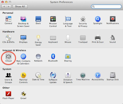
Open System Preferences by clicking the Apple icon in the upper left corner of the screen. Then press the iCloud icon, circled in the following screenshot:

iCloud System preferences change settings

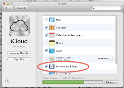
Then deselect the "Documents and Data" checkbox, as shown below:

iCloud documents and data checkbox

You will be prompted with the following warning:

icloud warning

It sounds drastic. It means is that documents stored in iCloud (from any iCloud-enabled device you own) are no longer synced to your computer. But it also gets rid of iCloud as the default destination for saving or opening files.

It would be great if Apple simply had an option to treat iCloud as a folder on your hard drive, much in the same way Dropbox and other cloud storage systems such as Google Drive work (see also my manual for Google Drive). Or, Apple disabled iCloud as the default "save" location.

But the company has two reasons for integrating iCloud so tightly into your Mac's storage and file systems:
  1. iCloud only has 5 GB of free storage. By forcing iCloud as the default storage location, the limit will rapidly be crossed and some people will be forced to upgrade to paid storage plans.
  2. Apple wants to make sure that its personal cloud storage system triumphs over competing products such as Dropbox and GDrive.

If enough people start turning off iCloud, Apple may rethink its approach to the iCloud user experience. On the other hand, as long as the competition is so strong, and the market for personal cloud services is still in its infancy, Apple may be forced to stick with the current setup.

Tuesday, May 15, 2012

Yahoo's Synced Messages folder

yahoo mail synced messages folder

A few million Yahoo users (including me) got this message in our inboxes this morning, explaining the mysterious "Synced Messages" folder that had been added to our accounts. Here's the explanation we received:

At Yahoo!, ensuring the safety and security of your data is important to us, and we know how critical your email is to you. We recently experienced an issue syncing emails for some of our users when accessing email from an IMAP device like an iPhone or an Android phone. Emails that you might have moved from your inbox to folders (including the trash folder) may have been temporarily unavailable. We fixed this issue, and recovered emails that may not have been synced to the right folder.

This is what you can expect to see:

- We have automatically added a folder called "Synced Messages" to your email account today located in the left navigation of your inbox.

- Our systems identified emails that may have been subject to the syncing issue and added them to the "Synced Messages" folder.

This is what you should do:

- Open the "Synced Messages" folder and move any messages you wish to keep to the inbox or your other personal folders.

- After you move the messages you wish to keep, you can delete the remaining messages in "Synced Messages" folder as well as the folder itself. The "Synced Messages" folder will remain in your account until you delete it.

At Yahoo!, we strive to give you the best email experience possible. We apologize that some email was not synced properly, and please know that this issue has been fixed.

You may also be interested in:

TMobile monthly 4G + Samsung Exhibit II = Android on the cheap

Friday, February 24, 2012

Getting close to launching our app

We're getting close to launching the Invantory app for iOS mobile devices. What does the app do? Well, the first iteration is aimed at making it easy for people to buy on Craigslist with an iPhone or iPad. Here's a screenshot of what a classifieds listing looks like:

guitar classifieds

This looks a lot different than what you typically see on the PC/Web version of Craigslist. In addition, the experience of browsing listings on a mobile device using Invantory is really unique. Instead of looking at text lists and using search engines, the focus is on photos. This helps people quickly determine what is of interest, and also helps them evaluate quality.

Future versions of the Invantory Craigslist app will do lots of other things, including creating classifieds and distributing the listings elsewhere.

Has it been tough building an app? For my partner Sam, it has been extremely time-consuming, with many technical hurdles to overcome. Are we nervous about the launch? Absolutely. Are there ups and downs associated with running a startup? Every week I am on a startup roller coaster. But nevertheless we are making progress and are really looking forward to what matters: Whether or not people will like using the app. We hope you can try the app and let us know. Download the app via the Invantory website, or sign up to be notified by email when it launches.

Sunday, January 8, 2012

Google Earth overlays

In the past year, I have had a few chances to play with Google Earth and try out some of the amazing tools that come with the program. For the Social Television class I took at the MIT Media Lab, I used placemarks, 3D buildings, and zooming animation to create the software demo for our final project. More recently, I was able to use Google Earth to create Craigslist coverage maps that show the rough boundaries of the five Craigslist areas in Massachusetts.

How did I make the different-colored areas in Google Earth? By using overlays. It's a drawing function that lets users trace points on a map with a mouse. Once the points are joined, the area looks filled in. Different colors and transparencies can be applied, which lets overlapping areas be clearly shown (see the Invantory blog post, above for an example of overlapping overlays).

Overlaps are an extremely useful tool. For instance, in the map below, I wanted to show Newton, Massachusetts, and nearby communities and commuter destinations using different-colored overlays. I basically hand-matched the inner overlay to the actual boundaries of Newton, which are a display option in Google Earth. The outer overlay was hand-drawn according to municipal boundaries as well as my own rough estimate of the area of downtown Boston that many Newton residents commute to every day:


Google Earth is a free download. I recommend using a reasonably recent and powerful desktop computer, as it uses lots of processing power to run and render sophisticated 3D images.

Friday, November 25, 2011

TMobile monthly 4G + Samsung Exhibit II = Android on the cheap


I'm one of those cell phone cheapskates. You know, the guy who didn't own a mobile phone until it was absolutely necessary, and then only got the cheapest phone/plan options possible -- or got it through his employer. For the past few years, I have been using AT&T GoPhone/Pay-As-You-Go plans and the cheapo Nokia feature phones that come with them. A few weeks ago, however, I joined the elite, getting a snazzy Android phone (Samsung Exhibit II) and a really reasonable carrier plan -- the $30 TMobile Monthly 4G plan -- through Walmart. I'll give a quick review of the phone and the T-Mobile plan below.


First, a relevant fact to this review is that while I have been a cellphone cheapskate for a decade, I am actually a pretty heavy iOS user. I don't own an iPhone, but we have an iPad at home as well as two iPod touch devices. The newer one (4th generation) has been something that never leaves my side -- I use it for email, photos, twitter, Instagram, the Weather Channel app, music, and about a dozen other regular uses (I have wi-fi at home and work, which enables a pretty good mobile experience at these locations). If I had the funds to afford an $80 or $90 monthly iPhone plan through AT&T or Verizon, I would have gotten an iPhone, but I don't. But my work as co-founder of Invantory (a company that is developing a Craigslist app) was getting more intense and requires more frequent calling. This forced me to get a new phone plan with more capacity.

I began hearing about the TMobile Monthly4G plan in October, offered through Wal-Mart. It sounded great -- the cheapest option cost $30 per month, included unlimited texting and Web (first 5G at 4G speeds, 2G thereafter) and 100 minutes of talk, with 10 cents per minute thereafter.

This worked out to be far better than the AT&T GoPhone plan, which costs $25 for 100 minutes of talk and charges 25 cents for additional minutes. AT&T texting is 20 cents and data is similarly expensive and practically unusable on the tiny Nokia browser and terrible e-mail interface. Virgin reportedly had a similar plan to T-Mobile, but it was $5 more per month.

T-Mobile/WalMart offered a bunch of different phones, but I was really set on Android -- it was an iPhone-like experience and will eventually become a platform for Invantory's mobile classifieds. T-Mobile had an Android phone called the Samsung Dart, but it had poor reviews (including poor voice quality). The Samsung Exhibit II, however, sounded much better, and worked with the new monthly4G plan.

The plan had just been launched, so I began visiting local Wal-marts to look for the phone and try it out. It was useless. The boxed phones for the Tmobile Monthly 4G plan were there, but they were feature phones and the Dart. The Exhibit II wasn't in stock, and staff had no idea what I was talking about (even in a store which the Walmart website listed as having it "in stock"). The phone was also supposed to be available through T-Mobile stores, but at a 25% markup ($250 vs $200 in Walmart). I eventually gave up seeing the phone in person and just ordered it online through Walmart.com.

Out of the box, the phone worked well, but there were some hiccups. Here's the low down:

Activation and voice service
  • Activation via live T-Mobile customer service is a problem if you want the $30 plan -- for some reason the reps only have another $30 plan (1500 talk and text, see screenshot below) and will direct you to register online if you want the 100 minutes talk/unlimited Web & text.
  • It didn't seem to be a problem to get a phone number in my area code (I mention this because a long time ago it used to be an issue with new mobile phones, or you'd be assigned a phone in the 857 area code)
  • Even though T-Mobile apparently charges minutes against some plan users who make calls on their Wifi signals. "Wifi Calling" is not counted against the Monthly4G plan minutes -- I talked with a customer service representative to confirm this. After conducting a test, I determined that Wifi Calling is counted against your minutes, and another T-Mobile rep confirmed this (contradicting what the first one said). Therefore, I advise turning off Wifi calling and putting the load on the T-Mobile network. You're paying for it either way, might as well make T-Mobile work for it and reconsider their policy. 
  • The Samsung Exhibit II has a excellent voice quality, and I have yet to have a dropped call.
  • 4G coverage seems reasonably good in and around the Boston area, even on some subway lines (MBTA Red Line, but not the Green Line)
Exhibit II hardware
  • The Exhibit II is a very lightweight phone that has a somewhat slippery plastic case -- it will easily fall out of loose pockets when you are sitting down.
  • The processor is adequate, but I have noticed that sometimes it hangs (especially if you are awakening it from sleep with an app already open).
  • Storage is paltry compared to my 4th-generation iPod touch -- USB storage is listed as 1.6 GB, and device memory >800 MB. It's not a problem for people who don't have a lot of media on their phones, but if you are a heavy music, photo, or video user you will have to get an SD card.
  • The battery seems to charge fast. However, I generally have to charge it once every 36 hours 15 hours, leaving it on all the time with relatively low voice usage and high "other" usage (surfing, camera, apps, email, etc.). Update: Battery life seems to be getting worse as time goes on. Part of this relates to the fact that I am using more apps and talking more often on it, but it seems the decline is excessive, even though I am shutting off GPS and often disabling Wifi (note: Disabling wifi apparently increases battery usage, owing to the fact that the device is constantly searching for 4G signals. I've found the best tactic is to leave wifi on all day). The batteries in my iPod touches are far more resilient after many thousands of hours of heavy wifi, app, and camera use.
  • Screen quality: Excellent! At 480 x 800, the dimensions are slimmer than the iPod touch (640 x 960 pixels), but the resolution seems comparable.
  • Photo syncing via USB doesn't work with my two-year-old iMac and iPhoto. But sharing to Dropbox from photo app on the Exhibit II partially makes up for that problem.
  • The Wifi receiver is adequate, with slightly less range than the iPod touch. Switching between Wifi/Edge/3G/4G happens in the background and works well.
Camera

This is probably my biggest beef with the phone. Here are the pros and cons:
  • The resolution of both the front-facing and rear-facing cameras are acceptable and superior to my 4th generation iTouch. 
  • The flash works very well in low-light settings. 
  • But the lag for shooting is sometimes as long as two seconds, which makes setting up shots of people and moving objects difficult and irritating. Auto-focus is apparently to blame, and it can't be turned off (although you can switch to a pretty nice macro setting). 
  • There is no "camera+" or Instagram app for the phone, which is a big negative for someone coming from the iOS universe.
  • The other problem is color -- reds and oranges are definitely muted, as you may be able to see from the photo below. The wood floor actually has a richer color, and the red and yellow legos are a very bright, child-friendly color in reality (the reds below should be fire-engine red, but they're not). The blues, meanwhile, are too strong -- in this photo the detail on the blue boxes can't be seen from afar because the color is so intense.

Samsung Exhibit II test

Android Software
  • Once you get used to Android (my Exhibit II came installed with Android 2.3.5 "Gingerbread") it's a wonderful platform. But getting used to some of the quirks takes time. There are other negatives, too, which I will detail first.
  • "Settings", "My Accounts" and "Accounts and Sync" and individual app settings contain overlapping information and controls. It can be hard to find what you are looking for, and difficult to do certain things such as turning off notification sounds (although there is a "Sound Settings" option, it does not control all sound settings -- you'll have to root around in various apps to turn everything off). 
  • For other settings, I still haven't figured out to adjust them -- such as turning off or changing the startup/power down sounds. How do you turn off the "recharged" sound, so it doesn't wake you up in the middle of the night? I have no idea. iOS is far superior, centralizing all system settings and many app settings in a single place ("Settings"), and making it very easy to disable all sounds.
  • To get carriers to adopt Android, Google made the operating system customizable to a certain extent. The result: Most American carriers, including T-Mobile, load up their phones with crapware which apparently can't be deleted. I got T-Mobile TV HD, T-Mobile Mall, Kies Air, Blio, Yelp, an antivirus program, "Bonus Apps", and bunch of other stuff I didn't want and cluttered up my screens. As it is apparently impossible or difficult to delete them, I had to create a special screen to hold them. Apple forces carriers to stay away from the crapware  practice and allows people to easily delete apps and files, which makes iOS far superior for new users. 
  • Android confusingly has separate "Home" and "Apps" screens, both of which can be customized. iOS only has one view, and allows you to place files and Web bookmarks on it, giving it the same prominence as apps.  
  • Apps: Android does not win on quality (as a more open system, there are a lot of crappy apps out there) but the process of downloading, installing, and trying out the apps is much faster -- no need to enter an iTunes password each time or hunt for the app once it's installed. I installed lots of apps, including Dropbox, Instagram and Google Docs for Android (explained in detail in this Google Docs for Dummies clone)
  • Email: Android's default email app looks better and seems to work faster than iOS on wifi. My only complaint is "mark as unread" is not available (it is, however, an option in the Android Gmail app). 
  • Sync: I've always felt that iOS syncing (and now iCloud) is imperfect. I'll set stuff up, such as Google calendar, and it doesn't seem to get imported into my iPod's Calendar app. But Android really rocks -- you can even attach and group Facebook and twitter accounts, which makes for a better Contacts list. 
  • Customization: If you can find the right options, you can do some pretty neat things, such as setting up live wallpapers that move (a swirling galaxy is one of the defaults). iOS will surely catch up, though.
  • Keyboard and voice input: The Android keyboard is not as good as the one on iOS devices. This is partially the result of the Exhibit's narrower screen, but I also find myself having to "aim" a little high to press the right character. On the other hand, voice input integrated into the keyboard is superb. Just press the microphone on the keyboard (or next to the search magnifying glass), speak clearly, and you'll see it entered. It may not compare to Siri, but considering Siri is not available on most iPhones or any iPods, I'd say Android has the upper hand at the low end of the market.

I may have some other updates as time goes on and I use the phone more. But so far, so good.


Screenshot: Current TMobile Monthly 4G rates:

Tmobile monthly 4g plan rate sheet

Wednesday, October 5, 2011

Steve Jobs' star

Yesterday I was thinking about Steve Jobs, and the fact that he wasn't even mentioned at yesterday's iPhone event in Cupertino. Now we know why.

People who knew him will be able to eulogize his passing better than I can, but I did want to say that he has touched my life since the earliest days I was involved in computing. At my middle school in the early 80s, we had a computer room set up with Apple II+ and Apple IIe computers. It was on those machines that I first began to learn how to program, which set up a life-long affair with hardware, software and digital media that continues to this day.

It didn't stop with that early Apple experience. Eight years ago I got back into Apple's products through my "half dome" iMac on which I spent many late nights running remote database queries and writing a graduate thesis. An early iPod classic provided the soundtrack to my morning and evening commutes, and more recently I have treasured my iPod touch, which has really let me improve my life and connect with people in ways that I never could have imagined just a decade ago. With this remarkable little device, I was even able to take a two-week international trip without lugging along a laptop, as I have done during earlier overseas trips. The iTouch handled email, news, gaming, utilities, photos, twitter, Facebook, and even Skype. It was on this trip that I realized that we really are transitioning to a post-PC world, and Steve Jobs is directly responsible.

Last month I attended the dedication of Steve's star on the Entrepreneur Walk of Fame in Kendall Square, not far from MIT's campus. Journalist Dan Lyons (who famously created the parody blog "Fake Steve Jobs")  came up to the podium to give a short dedication. The MIT Entrepreneur Center's Bill Aulet noted Lyons was reluctant to do so, as Steve was known to be in grave health. Lyons spoke to the small crowd, remarking that while Jobs had stepped down from running the company, he insisted on remaining as chairman of the board.  "Even now, in his very poor, slipping health, he can not let go of Apple," Lyons said. "He has literally given his life to his vision." Lyons added that Jobs was unafraid to have his company cannibalize its own products, in the name of progress and creating great things.

I'd like to end this post with the engraving from Jobs' star in Cambridge. It reads:
"Being the richest man in the cemetery doesn't matter to me ... Going to bed at night, saying we've done something wonderful... that's what matters to me."
RIP, Steve.

Monday, September 12, 2011

The new BostonGlobe.com: Will a print-like experience work for online/mobile?

(Note: A version of this post appeared in comment form on Universal Hub) Let me preface this post by saying that I haven't tried the new bostonglobe.com site yet, other than to look at the front page (see screenshot, below). It's definitely a clean, print-like interface, but I couldn't get any further -- I attempted to log in so using my existing Boston.com credentials (which are supposed to work - "Boston.com users or Boston Globe subscribers can use their existing registered e-mail and password here. ") but BostonGlobe.com didn't accept them. There is no password recovery feature for BostonGlobe.com at the moment; you are instead routed to a live customer service chat app but no agent appears ... I imagine because quite a few people have support issues right now, on the first day of the launch.


Still, based on what's been stated publicly about the site and its business model, I can make some observations. I believe bostonglobe.com will have a tough time gaining traction as long as a significant amount of supposedly premium content remains freely available on its internal competitor -- Boston.com (and the Boston.com mobile app). For instance, I am looking at "David Ortiz says now is the time to panic" for free on both. I know when I come back tomorrow there will be more free content, so why should I start paying $4 per week to see it formatted differently on bostonglobe.com?

I suppose the New York Times Company (parent of the Globe) could cut off the spigot of free content on Boston.com, but it's easy enough to find commodity news (sports, crime, weather, etc.) elsewhere for free, including UniversalHub.com, BostonHerald.com, the local TV station sites, etc.

Cutting off free content would also hurt Boston.com in the long run, in terms of page views/display ad revenue as well as mindshare. Once readers have decamped for other sources of online content, it's hard to get them back.

The Boston Globe's publisher may argue that they are targeting a different demographic -- people who like print and actually have the time to spend 30 minutes with the site every day. But that is surely not a good long-term strategy. It's a small potential audience, probably a fraction of the Globe's current print readership who are willing to shell out extra to look at it on a tablet/smartphone/browser. The potential audience may get bigger as more print subscribers get smartphones and tablets, but keep in mind that those people will also start to use their devices to install information and entertainment apps from other sources, which further lessens the attractiveness of bostonglobe.com. Why subscribe, when there are so many other things to do and see on the device?

What could work for the bostonglobe.com? In my opinion, the editors have to have concrete plans for truly original content -- information, community, tools, and even entertainment that can't be found anywhere else. Another strategy could involve working with local merchants to offer products, services, and discounts that can't be found anywhere else. If I knew that my $4/week subscription could consistently bring me more valuable benefits or savings at shops, supermarkets, service providers, auto dealerships, etc., I might be willing to subscribe.

I'll be curious to try out the site once the login issues are worked out.

Sunday, July 10, 2011

iOS game development: The making of Egg Drop


It's an exciting feeling to be a part of a team that creates something special. It's even more exciting when you see early users not only getting a kick out of the product, but asking to use it again and again.

educational iPhone game
That was our experience with Egg Drop on the iPhone, an educational game and our student team's final project for 11.127/252/CMS.590, Computer Games and Simulations for Education and Exploration (see also my post on an earlier student project from the same class, "A curriculum for learning computer programming in WoW"). Our assignment, which built on nearly three months of instruction, theory, readings, and other projects, was to design and produce a digital game that is playable for 15-20 minutes. "You should identify clear learning goals and map them onto game dynamics," we were told. To actually develop the game, it took about 24 days from the initial ideation sessions to the final presentation at class demo day.

There is a lot of flexibility in the term "digital game," and the half-dozen student teams in the class pursued all kinds of ideas. On demo day, we saw Terminus, a text-based adventure to teach terminal commands ("Zork meets terminal," was one way of describing it). Another student team created a PC game called Rocketmouse that taught children the fundamentals of gravity.

The class had a lot of Course 6 undergraduates, including some who had written games in the past. But the instructors (Eric Klopfer and Jason Haas) made an effort to balance out the teams with experienced programmers and people who couldn't program, but were able to handle other tasks.

Our team didn't go into the project thinking that we would make a mobile game. The ideation process started with the class brainstorming on potential learning topics; those ideas were put on a whiteboard and then people could choose which team they wanted to join. Inspired by a recent engineering documentary about the construction of a helipad on top of a wind-blown skyscraper, I suggested doing some sort of construction-based game that would teach basic architectural concepts. At the time, I was thinking of something on a PC or the Web, which would allow for a more sophisticated interface.

Alec, a Course VI classmate with whom I had worked on a “digital gates” board game earlier in the semester, was interested, along with a few other undergraduates. We discussed how to improve the concept. One of the first suggestions was to do it as an iPad game. The idea was to use a touch-screen interface to build a skyscraper, and then testing the strength of the construction with various environmental forces such as wind, earthquakes, and other disasters. Alec came up with a clever twist: How about turning the game into a variation of Angry Birds? Instead of being the birds trying to get at the pigs, the player would be the pig, trying to protect the egg from being knocked down, by building a strong-enough structure.

The “Reverse Angry Birds” proposal (also known as “Reverse Upset Avians”, or RUA) was put on a whiteboard with about a dozen other ideas. It got some votes from the class, and was chosen as a finalist project. Five people joined the team in all, and we started to refine the idea and discuss the practicalities of implementing them.

One decision that we had to make right away concerned the platform. While the iPad sounded promising, there was a problem: Aside from me, no one had an iPad, which would make life difficult for our developers when it came time to test the app. The iPhone seemed like a better idea, because:
  • Three of us had iPhones or an iPod touch
  • Three of us had Macs, which meant we could work in Xcode, Apple’s developer tool for the iOS SDK
  • Alec had experience developing games and developing on the iPhone platform, and was also familiar with a 2D game engine for the iPhone called cocos2D.
The team agreed that the iPhone/Xcode path was the way to go. Clearly, myself and the one other person who were not Course VI would be unable to build a game, but there was room for us to do “code-like” activities, ranging from building artwork and sound files to creating levels in XML. I was capable of doing those tasks (and had some prior experience with level design in our 6.898/Linked Data final project), and could do user testing/QA (I had two young subjects who were willing to pitch in, as described below).

In the proposal document submitted to our instructors, we described the game as follows:
Egg Drop is a physics-based game designed for the iOS platform that attempts to teach basic intuition of physics and stable structures.

Because it is an iOS game, the only way to play Egg Drop (barring a release on the Apple app store) is to download and compile the source. The source of the game is hosted publicly on Github and can be found at:

https://github.com/alect/Digital-Egg-Drop

Learning Goals:
  • Gain a rudimentary understanding of physics, construction and other principles involved in building structures
  • Learn strategies for building stable structures that can survive the elements.
  • Learn to use resources in an optimal way to meet construction goals.
  • Develop the hypothesize -> experiment -> redesign strategy of designing, which is a useful skill in many wider disciplines than construction. The flow of the game should lead the player to use this strategy inherently, and hopefully bring the strategy with them from the game.
Our plan was approved, and we got started on RUA. MIT has built up a culture around experimentation and prototyping and we all got to work pretty quickly. Alec was the lead developer, and took on tasks relating to integrating the physics engines, building the objects and resource manager, and creating a sound engine. He built a working prototype within a few days and uploaded it to github, which let those of us with Macs download it and try it out in Xcode’s iPhone simulator.

Another Course Sixer, Sarah, hadn’t used Xcode or Objective C before, but got up to speed very quickly. She was responsible for much of the final design as well as an in-game tutorial, which really helped make the game more appealing (you can see the tutorial in the gameplay video at the bottom of this post). She also created the system to import levels in XML format, which made it easy for me to do some age-appropriate level design and implementation on my own for our user testing -- before the XML engine was built, in order to alter levels during testing I had to change values in arrays and arguments in ResourceManager.mm. These changes were difficult to share with the rest of the team and prone to error, so Sarah’s work was very helpful. A third Course Six concentrator, Stephen, didn’t have a Mac (a requirement for Xcode) but worked on artwork, sound files, and documentation. The other member of the team worked on level design.

The game evolved from our original vision of creating a variation of Angry Birds. Creating the gameplay and artwork for the pigs and birds would have been extremely difficult and time-consuming (we only had a few weeks before demo day on May 10). We settled for a slimmed-down version of the game in which the goal was to build a structure that would protect a single egg from an onslaught of natural disasters at the end of each round. For instance, the kid-friendly level #3 used the following XML as inputs:


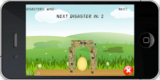
On the screen of the iPhone simulator, this translated to an egg resting on the plain at the start of the game (posx and posy describe its starting position). The player could place, in order, two vertical wooden planks, a horizontal straw block, and a horizontal brick, before the disaster (a meteor falling from the sky, directly on top of the egg) occurred. The only way to survive: Placing the two vertical wooden planks next to the egg and the horizontal brick resting on top of the plank, over the egg. Any other combination resulted in the egg breaking and “game over” for the player.

As the game evolved, we dropped “Reverse Upset Avians” and started calling it EggDrop. It was an instant hit with my kids, even before we had meteors and earthquakes. The simple physics of placing planks around the egg was entertaining enough in sandbox mode (see screenshots, below). But when better artwork, different building materials, nails and other elements were added, it was addictive. My younger child in particular would ask to play it when he came from school, and after I came home from a long international trip, one of the first things he asked to do was play the game on the iPhone simulator.

One interesting element of game design that came up with the Egg Drop project was the target audience. I thought we should really be clear who we were targeting at the outset. Segmentation and “Total Addressable Market” exercises are part and parcel of the Sloan way in classes such as New Enterprises. But we ended up taking a much more flexible approach, as described in our proposal:
“One advantage of iOS and other touch devices is that they support a very wide age range. We hope the game will be playable by children as young as five or six while still being entertaining to adults. Young children will most likely reap the most benefit from the educational concepts the game presents. In addition, we found that we could cater levels to fit different age ranges, making the game customizable for all learning levels.”
While age customization was possible, for the purposes of testing we only had two versions: One for us and college-aged friends, and a simpler version for younger elementary school students. I worked extensively on the kid version, and developed new age-appropriate levels based on regular user testing. Here are a few excerpts from my user testing diary, which was submitted as part of our final project:
4/30/11

The kids had a fun time with a modified version of alect-Digital-Egg-Drop-3357c7c (I added about 30 extra block and nail objects, so they could play longer). They definitely get the nailing aspect of the construction, and used it to protect their egg almost immediately.

++++++++++++++++++++++++++++++++

5/4/11

Tested alect-Digital-Egg-Drop-9f0fc79 on my son. This was the first time he had seen the disasters, which he really enjoyed (especially the earthquake, which sometimes sends blocks flying).

I was also surprised to see that he right away figured out the solution to the wind disaster (nailing something to the floor) which vexed me when I saw it the first time.

He also used extensive experimentation to try to solve all of the problems he observed. For instance, for the earthquake, he tried positioning the blocks close to and further away from the egg, nailing different size blocks to the floor, etc. He gave up after 4-5 unsuccessful tries, at which point I showed him how to do it. Then he played to the end (two tall planks).

He noticed and liked the new egg [artwork].

++++++++++++++++++++++++++++++++

5/6/11

Played build alect-Digital-Egg-Drop-d3eb420, which has some memory issues that Alec addressed. However, we noticed a bug after the second level that prevented us from going to the third level -- the level up button didn't respond on the emulator.

The gameplay is fun, and as a proof of concept it is good, but I wonder if the learning couldn't be more robust. Maybe if we had more time ...

++++++++++++++++++++++++++++++++

5/9/11

Building out levels in XML. I am using Google Docs spreadsheet to track the progressive difficulty of the challenges, and using my own judgement and gameplay to see how they work.

The advantage of using oneself for testing is I can quickly rearrange the blocks or disasters, reinsert them into ResourceManager.mm, and play the new version on the emulator.

I am going to try to introduce it to my son tomorrow morning ... I unfortunately won't see him for the rest of the day.

+++++++++++++++++++++++++++++++++++++++++++++

5/10/11

My son hadn't seen the new designs, so he was very happy to see the artwork. He also liked the meteor, cushion blocks, and the idea of the termites. He got up to speed pretty quickly on the simple progressive levels I set up for him. On the quake level, which requires surrounding the egg with cushions and nailing them together in a certain way, he couldn't solve it, and took an interesting area of experimentation that I hadn't considered -- reinforcing the cushions with wood braces.

The other thing that I am conscious of is the game really has to be customized to age/ability. What appealed to him as a 6-year-old wouldn't appeal to older players.
One thing that’s worth mentioning about the testing is I didn’t need to pressure my kids to help out. Both of them love games. My son has probably tried a few dozen age-appropriate titles on my iPod touch, and regularly returns to the ones that are most entertaining. It was clear that Egg Drop fell into the same league as favorite games such as Angry Birds, Cro-Mag, Fruit Ninja, and the Simpsons game. He simply couldn’t get enough of Egg Drop, even during the early builds when the game was still rough around the edges. Here’s a video of him trying out an early version, about one week into the development process:


Beyond the experience of working on iOS game design, there were several other takeaways from the project. One was being able to participate in a rapid prototyping process integrated with user testing. This combination is held up as an ideal at MIT and elsewhere, but getting the right team and the right testers in place can be difficult. Before coming to MIT, I worked in Web media for years. Even on those rare occasions when my employers had adequate engineering resources in place to develop new products, testing was usually handled in-house and at a very late stage. Sometimes this was because testing was not considered a crucial part of the product development process, but at other times it was difficult to find actual users or the product had to be kept under wraps out of fear of premature leaks or tipping off the competition.

For Egg Drop, not only was the team technologically top-heavy (three out of five were programmers), but we had access to real users in our target audience, which let us observe gameplay, hangups, and other aspects of the user experience. This feedback loop led to better gameplay and helped us eliminate speed bumps and outright bugs at a relatively early stage.

A second takeaway related to gameplay theory. While the Egg Drop project was focused on real gameplay issues and the practicalities of developing a game for a mobile device, I did find myself looking back to some of the research that we had studied in class earlier in the semester, in particular the readings from James Paul Gee. He articulated a lot of modern thinking about models, video games, and learning in his 2008 paper, Learning and Games (e.g., “Video games offer people experiences in a virtual world ... and they use learning, problem solving, and mastery for engagement and pleasure”). His “situated learning matrix” for understanding how context-based learning in games can be applied to the world at large was described in terms of first-person shooters in 3D worlds. But one can see how a modeling experience in a 2D world like Egg Drop (such as my son’s experimentation with reinforcing braces that I observed in the user testing diary) might also be internalized, generalized, and applied to other situations, even if protecting eggs from meteors never figures into his daily life. This ties back to our proposal to "develop the hypothesize -> experiment -> redesign strategy of designing, which is a useful skill in many wider disciplines than construction."

Gee introduced another interesting concept in What Video Games Have to Teach Us About Learning and Literacy. The concept of “Semiotic Domains,” as it applies to video games, basically says that players will find it easier to transition to new scenarios that have similarities to old scenarios they have already encountered. In terms of gameplay, this not only helps explain the continued popularity of RPGs, "shooters," and other genres, but also how specific features work for some gamers and not for others. For instance, my son was already familiar with the iPod touch and physics-based games such as Ragdoll Blaster and Angry Birds, which made it easy for him to get into Egg Drop. However, he was perplexed by the preview of the next object in the upper right corner of the screen. This convention dates from 80s-era games like Tetris, which he had never tried. He therefore applied his own gaming experiences to Egg Drop, and attempted to drag the preview pieces onto the playing area (this can be seen in the video of game testing, above). In a commercial development project, such an observation among many early testers might be a cue to re-evaluate that feature.

A third takeaway from the Egg Drop concerned the design of the game, not only as it relates to gameplay, but also the artwork used in the game. While the cocos2D physics were slick, the graphic elements were very simple (I should know -- I made the bricks and a few other elements using Preview in OS X). But to our young testers, it didn’t matter. The game art was enough to convey the concept, and the gameplay was addictive.

Fourth takeaway: As our instructors mentioned at one point late in the semester, sandbox mode can really work for younger players. I saw proof with my testers on the first few builds, before Alec had integrated the disasters and win states for levels. In the proto-Egg Drop, it was possible to drop a practically unlimited number of horizontal planks around the egg, but there were no disasters or special materials to work with. It didn’t matter. The kids simply liked the physics of the game, which allowed them to fill up the screen and sometimes model strange situations, such as a mountain of planks for the egg to roll down. I have many screenshots from early versions that show the playing area filled with planks:


Now the reality check: The analysis and observations above are based upon an extremely small userbase playing with test versions of the game. The ultimate excitement for Egg Drop would be refining it and releasing it to the wild, to see how a much larger population of players reacts. Of course, “refining it” would involve not only working on some of the issues identified earlier (level design, artwork, etc.) but also considering the original educational vision of the game -- teaching concepts related to construction and physics. We were not able to do enough basic research around how kids might best learn such concepts, which is unfortunate, because I believe the game is a marvelous vehicle for learning. But this also leads to the question of how to balance desired learning outcomes with gameplay. More experimentation would be required.

In the meantime, here’s a video of the gameplay and design, based on the final build in mid-May:


If you are interested in finding out more about the class, take a look at the course website. You may also be interested in reading about another mobile educational game development project I worked on in Linked Data (6.898) last year. More posts and videos relating to my MIT experience are listed below:
Wednesday, June 8, 2011

Data visualizations: Why most will never make it in the marketplace


Eric Hill, a buddy of mine from my old Industry Standard days, sent me a link to a RWW article about a cool new iPad application from Bloom Studio that comes up with an interesting way of visualizing a digital music collection. The app is called Planetary, and here's what it looks like:


Planetary (voiceover) from Bloom Studio, Inc. on Vimeo.

I was impressed with what they've done, but I am afraid it won't go far in the marketplace. At one time I had so much hope for data visualizations changing the way we browse and understand information -- in fact, Eric and I spent a lot of time discussing how Industry Standard site content (news and prediction market data) could be presented in new and potentially useful ways. But in the past several years, after checking out dozens of new interfaces and data visualization schemes, I've come to the conclusion that most will never catch on.


It's not the fault of the designers, but rather the limitations of audiences. For many consumers, simple formats (e.g., longitudinal line graphs, like the inset image of the US$/Euro exchange rate over the past three months) and plain ol' headlines are all they need. I think part of the problem is grokking a new visualization requires new mental models. In my opinion, most people simply aren't willing to expend the effort, especially considering the huge amounts of information out there and limited time that people have to consume it. I've seen so many interesting, creative visualizations out there but most never make it in the marketplace. Planetary is cool, but is a solar system/galactic metaphor for browsing music inherently better than an alphabetically ordered list of artists/albums/songs?

See also:

Wednesday, March 30, 2011

Dear PaidContent: Facebook comments suck

(Edit: The Facebook logon is used for their PaidContent50) For years, I've been leaving comments on PaidContent.org, a popular news blog for digital media. The topics interest me, the reporting is generally good, and I usually have some opinions to share.

Until recently, Most of the time, PC uses Disqus for comments. It's not a perfect solution (I especially don't like that the link to my name under a comment I leave takes users to a Disqus profile, instead of my own blogs), but it was flexible, and worked across many sites.

Today, I discovered a change on one of their specials: Leaving a comment on PaidContent now requires authentication through Facebook. Not good, as I explained in an email to PC's executive editor, Ernie Sander:
Ernie, a comment, and a question, about comments:

I have no problem with leaving my real name on PC comment threads, but I do not want my Facebook identity used here. I am hardly alone in this regard: PC is part of a professional network, and FB is purely personal, and there are very good reasons for keeping them separate.

I certainly don't want friend requests from random people, or my comments here showing up in my FB profile (yes, I know comments appearing in news feeds can be controlled, but frankly the rules and processes change so much I can't honestly remember if I set them up the right way, and can't be bothered to hunt down the latest checkbox in FB to figure it out).

Question: Is there any other way to leave a comment besides Facebook, such as LinkedIn or Twitter?

Thank you,

Ian Lamont
An issue that I didn't touch on is why PaidContent (and other publishers, including TechCrunch) have turned to Facebook comments:
  • It provides a real name (most of the time), which cuts down on trolling, flamewars, and low-quality comments
  • It hooks into Facebook users' networks, by sharing the comment on their feed (unless, as noted above, the user manages to figure out how to turn off the feature). It's free advertising for the publisher brand and can result in more clicks (and therefore more ad revenue)
  • For those publishers which have used installed commenting systems it potentially saves technical staff (and sometimes editorial staff) the trouble associated with securing and maintaining these systems. For instance, if the publication uses Drupal, installing and maintaining Akismet (a spam-fighting system) can be a pain)
Twitter authentication is possible, but unfortunately not many people seem to use real names/variations of real names on the service. However, I see a huge opportunity for LinkedIn (see What is LinkedIn?). Like Facebook, LinkedIn is a system that (usually) has real names of users. Furthermore, users of professional publications may want their comments fed into their LinkedIn profiles. LinkedIn apparently offers such a feature, but I have yet to see it used on the news/information sites that I read.

Tuesday, March 1, 2011

PeoplePixPlaces

(Update: This concept has evolved further and turned into a final project called WorldTV, complete with a software demo and video) From the Social TV class I'm taking this semester at the MIT Media Lab: A social TV application based on news. I came up with PeoplePixPlaces, a Web-based application that gives a window into local news, using geocoded video, pictures, and tweets, as well as individual users’ own social lenses. The poster explains the concept in more detail:

social TV

The genus of the idea predates MAS 571. Last semester in 6.898 (Linked Data Ventures), I proposed a similar project, PixPplPlaces. The one-sheet vision:


“People want to know a lot about their own neighborhoods.”

- Rensselaer Polytechnic Institute Professor Jim Hendler, discussing Semantic Web-based services in Britain, 10/18/2010

While superficial mashups that plot data about crime, celebrity sightings, or restaurants on street maps have been around for years, there is no service that takes geotagged tweets, photos, and videos, as well as associated semantic context, and plots it on a map according to the time the information was created. The idea behind PixPplPlaces:

• Index some publicly available location-based social media data in a Semantic Web-compatible form
• Plot the data by time (12:25 pm on 10/24/2010) and location (Lat 42.33565, Long -71.13366) on existing Linked Data geo resources
• Bring in other existing Linked Data resources (DBPedia, rdfabout U.S. Census, etc.) that can help describe the area or other aspects of what's going on, based on the indexed social media data

Potential business models:

• Professional services: News organizations can embed PPP mashups of specific neighborhoods on their websites, add location-based businesses who are their ad clients, or use the tool as an information resource for journalists -- what was the scene at the site of a fire on Monday evening, just before the fire broke out? Lawyers, insurance companies, and others might be interested in using this for investigations.
• Advertising services: A suggestion from Reed - "a source of ads/offers in Linked Data format - for the sutainability argument as a business. Maybe in the project you can develop an open definition that would let multiple providers publish ads in the right format that you could scrape /aggregate and then present to end users? If you demonstrate a click-wrap CPC concept you might be able to mock it up by scraping ads from Google Maps or just fake it."

To be researched:
• Is social media geodata (geotagged Flickr photos, geolocated Tweets) precise enough to be plotted on a map?
• Should this be a platform or a service?
• How can the data be scraped, indexed, or made into "good" Semantic Web information?
• Would any professional organization -- news, legal, insurance -- pay for it?
• How viable is the advertising model in a crowded field chasing a (currently) small pool of clients?
The Semantic Web requirements for the 6.898 project and emphasis on tweets and photos gave the tool a different flavor than the Social TV version; in addition, I didn't consider the possibility of using "social lenses" to filter the contributions of people in the user's social circle. But for both projects, I recognized that the business case is weak, not only in terms of revenue, but also in terms of maintaining a competitive advantage if open platforms and standards are used.

Incidentally, I first had the idea for a geocode-based application for user-generated content back in 2005 or 2006. My essay Meeting The Second Wave explains the original idea:

In the second wave of new media evolution, content creators and other 'Net users will not be able to manually tag the billions of new images and video clips uploaded to the 'Net. New hardware and software technologies will need to automatically apply descriptive metadata and tags at the point of creation, or after the content is uploaded to the 'Net. For instance, GPS-enabled cameras th at embed spatial metadata in digital images and video will help users find address- and time-specific content, once the content is made available on the 'Net. A user may instruct his news-fetching application to display all public photographs on the 'Net taken between 12 am and 12:01 am on January 1, 2017, in a one-block radius of Times Square, to get an idea of what the 2017 New Year's celebrations were like in that area. Manufacturers have already designed and brought to market cameras with GPS capabilities, but few people own them, and there are no news applications on the 'Net that can process and leverage location metadata — yet.

Other types of descriptive tags may be applied after the content is uploaded to the 'Net, depending on the objects or scenes that appear in user-submitted video, photographs, or 3D simulations. Two Penn State researchers, Jia Li and James Wang, have developed software that performs limited auto-tagging of digital photographs through the Automatic Linguistic Indexing of Pictures project. In the years to come, autotagging technology will be developed to the point where powerful back-end processing resources will categorize massive amounts of user-generated content as it is uploaded to the 'Net. Programming logic might tag a video clip as "violence", "car," "Matt Damon," or all three. Using the New Years example above, a reader may instruct his news-fetching application to narrow down the collection of Times Square photographs and video to display only those autotagged items that include people wearing party hats.

For the Social Television class, we have to submit two more ideas in poster sessions. I may end up posting some of them to this blog ...

Other posts about my MIT Sloan Fellows experience: